# install.packages("infer")

library(tidyverse)
library(infer)Bootstrap Hypothesis Test
Load Libraries
The infer package
Getting to know infer
vignette("infer")Parametric Bootstrap Distribution
The Parametric Bootstrap simulation assumes the null hypothesis is true then uses the data to construct a bootstrap distribution.
Today this means for each value in our sample R will choose a success or failure with probability
pfor each value ofn.
More than 1 relationship with simulation
- Make sample
- Write hypothesis notation.
- Create the simulated distribution.
- Find the probability we would get \(\hat{p} = 152/203 = 0.749\) based on the null hypothesis.
- Make the conclusion.
Make sample
# This creates a vector of 152 "Trues" and 51 "Falses"
more_than_1_relationship <- c(
  rep(TRUE, 152),
  rep(FALSE, 51)
)

#This takes the vector and saves it as a data frame so we can us it.
more_than_1_relationship <- as.data.frame(more_than_1_relationship)
Hypothesis notation
This part is the same.
\[ H_0: p = 0.5 \\ H_A: p > 0.5 \]
\[ \alpha = 0.05 \]
Side note the pipe |>
You may have noticed the occasional symbols |> or %>%.
This is called a pipe and it is an R operator that takes the output of the previous line of code and puts it into the first argument of the next line of code.
It often makes code easier to read, but can be confusing for first time programmers.
For this reason I have been avoiding it, until now.
Create simulated distribution
library(infer)

# Saving all the proportions we'll make
null_distn_one_prop <- more_than_1_relationship  |>

  # Here we tell specify what is a success
  specify(response = more_than_1_relationship, success = "TRUE") |>

  # This is where we set the null hypothesis
  hypothesize(null = "point", p = 0.5) |>

  # Choosing 10000 replications
  generate(reps = 5000, type = "draw") |>

  # This is
  calculate(stat = "prop")
Examine the samples.
#visualize is a graphing function, based on ggplot, for the infer package.

visualise(data = null_distn_one_prop)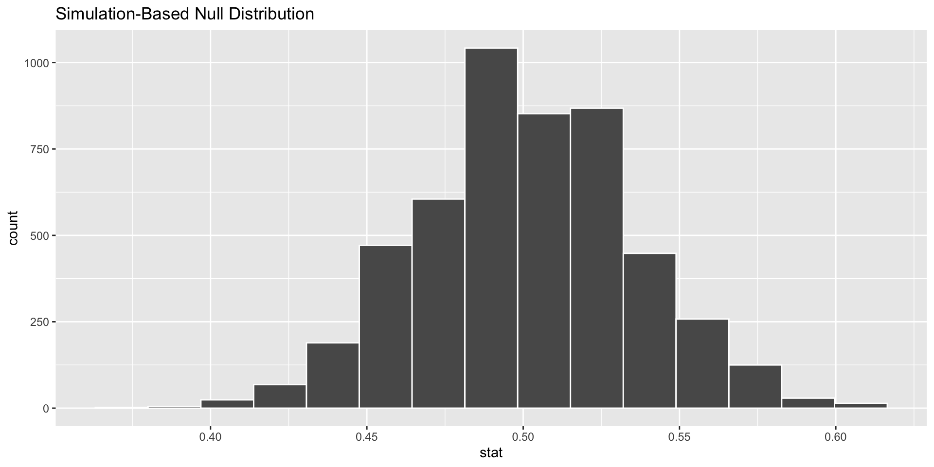
Calculate the p-value based on simulation
Visualize the pvalue
visualise(data = null_distn_one_prop) +
  shade_p_value(obs_stat = 0.749, direction = "greater")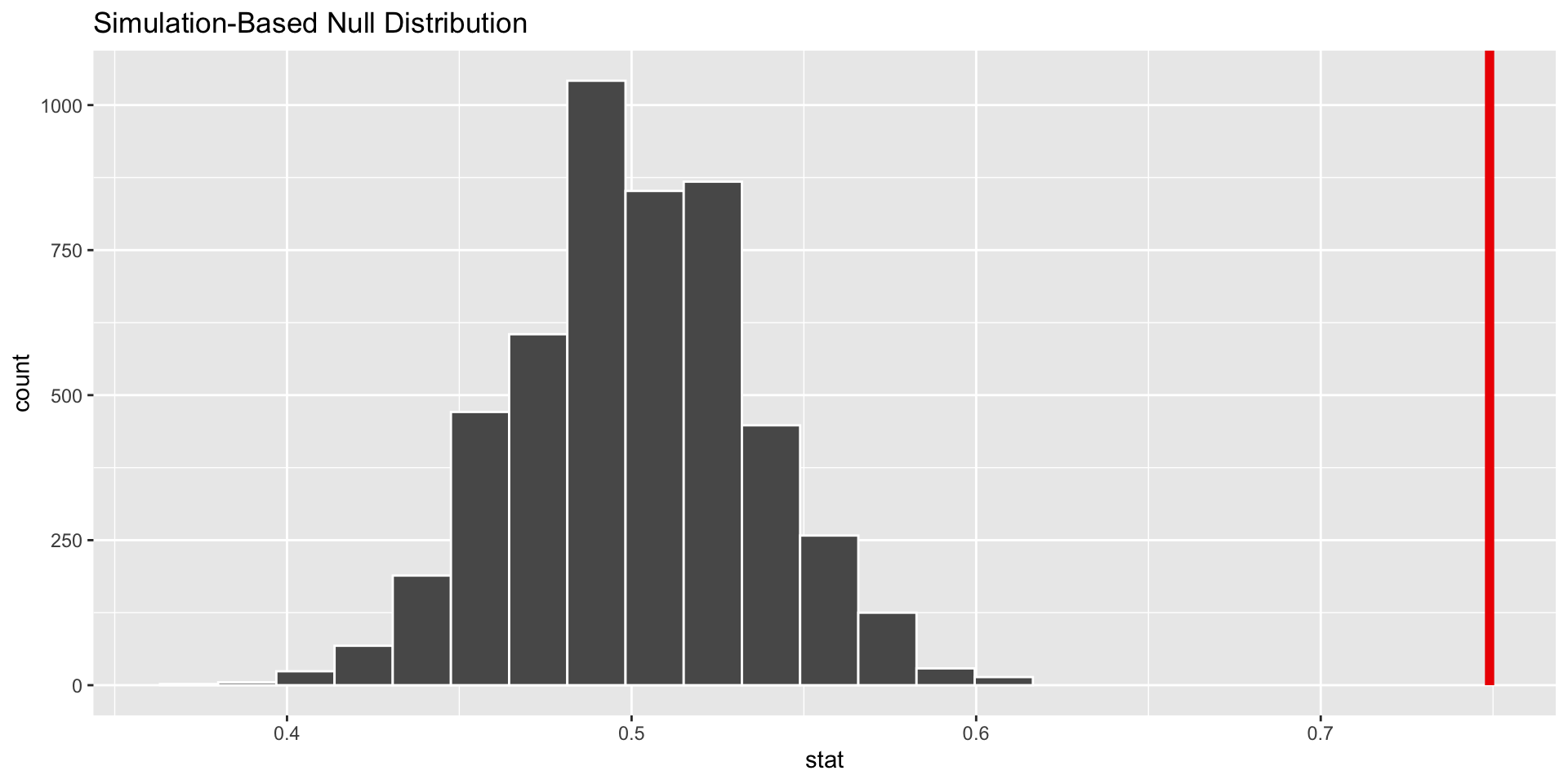
Calculate the p-value
get_p_value(x = null_distn_one_prop,
            obs_stat = 0.749,
            direction = 'greater')
# A tibble: 1 × 1
p_value
<dbl>
1 0Conclusion
The conclusion is the same as the first lecture from homework 6. The pvalue is much smaller than 0.05 so it is likely that a majority of students have had more than 1 exclusive relationship.
Mathematical vs. Simulation
Both methods are valid and often end at the same conclusion
Math uses formula based on conditions which must be checked. A theoretical distribution is built and probabilities calculated.
A simulated distribution is built from resampling the sample. Conditions can be relaxed as we can visibly verify that the distribution is normal.
Another example
Suppose it is known that nationally out of 100 people struggling with drug addiction, 40 of them will have some blood born disease.
A doctor at a clinic decides to test this hypothesis for her locality and samples 20 of her own patients. Of the 20 patients she finds 13 of them have a blood born disease.
Is this evidence enough to say that the locality is different than the proportion nationally?
Write out hypotheses
\[ H_0: p = 0.40 \\ H_a: p \ne 0.40 \]
\[ \alpha = 0.05 \]
Make some sample data
# This makes a 40% success sample. The rep() function repeats "disease" 13 times

clinic_sample <-  c(rep("disease", 13), rep("no-disease", 7))

# This saves the sample as a dataframe
clinic_sample <- as.data.frame(clinic_sample)

# This changes the name of the variable to "has_disease"
names(clinic_sample) <-"has_disease"

head(clinic_sample)
has_disease
1 disease
2 disease
3 disease
4 disease
5 disease
6 diseaseCalculate p-hat
We can calculate \(\hat{p} = \frac{13}{20} = 0.65\). But could do this:
p_hat <- clinic_sample  |>
  # Telling R what we care about with specify
  specify(response = has_disease, success = "disease") |>

  # Calculating the proportion
  calculate(stat = "prop")

#Notice how we saved p_hat for later use.
p_hat
Response: has_disease (factor)
# A tibble: 1 × 1
stat
<dbl>
1 0.65Create one sample from a bootstrap distribution
# setting a seed
set.seed(2024)

# Saving the df
clinic_sample  |>

  # Here we specify() what is a success
  specify(response = has_disease, success = "disease") |>

  # This is where we set the null hypothesis
  hypothesize(null = "point", p = 0.40) |>

  # This is how many times R will sample from the clinic sample
  # We are using draw to sample 1 value from a theoretical distribution with p = 0.40.
  generate(reps = 1, type = "draw") |>

  # This groups the reps together to find a proportion.
  calculate(stat = "prop")
Response: has_disease (factor)
Null Hypothesis: point
# A tibble: 1 × 1
stat
<dbl>
1 0.5More replications
We want to do this process a lot to create the bootstrap distribution.
# setting a seed
set.seed(2024)

# Saving the df
null_distn_one_prop <- clinic_sample  |>

  # Here we tell specify what is a success
  specify(response = has_disease, success = "disease") |>

  # This is where we set the null hypothesis
  hypothesize(null = "point", p = 0.4) |>

  # Choosing 10000 replications
  generate(reps = 10000, type = "draw") |>

  # This is calculating a proportion for each sample
  calculate(stat = "prop")
visualize() the bootstrap distribution
# cheater function to graph, works like ggplot(), but we don't need aes()
visualize(data = null_distn_one_prop)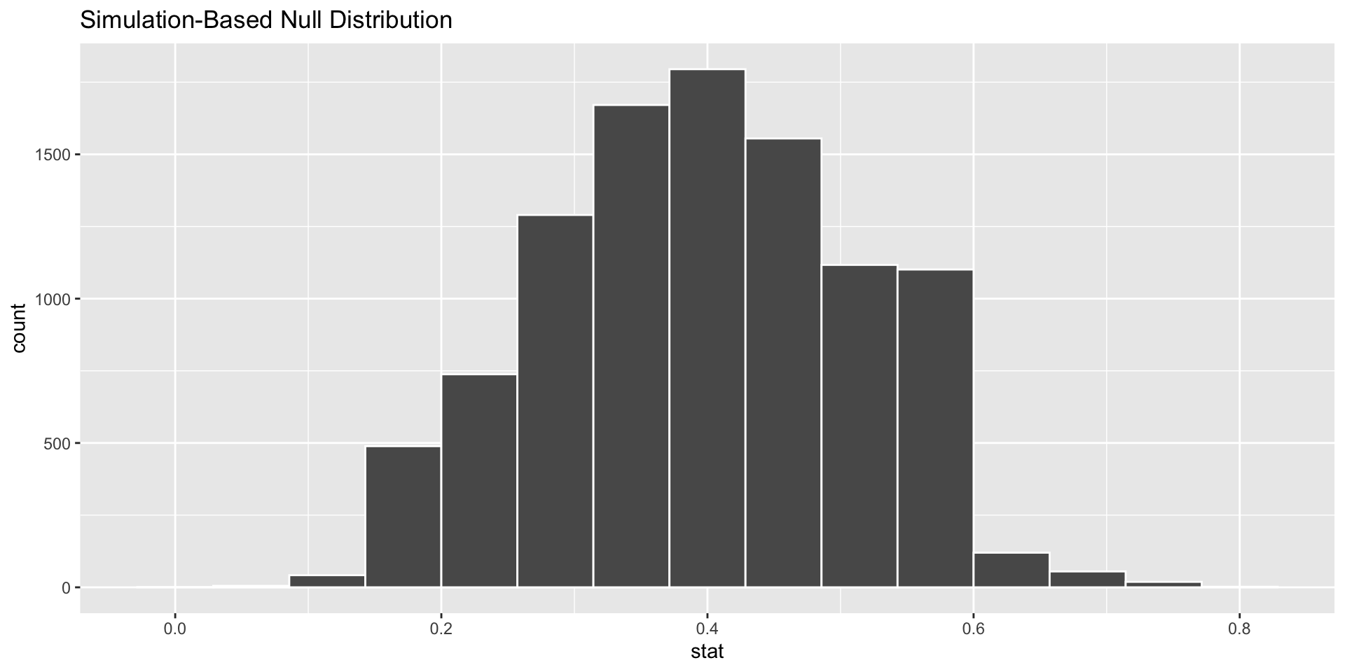
shade_p_value()
# shade the p value
visualize(data = null_distn_one_prop)+
  shade_p_value(obs_stat = p_hat, direction = "both")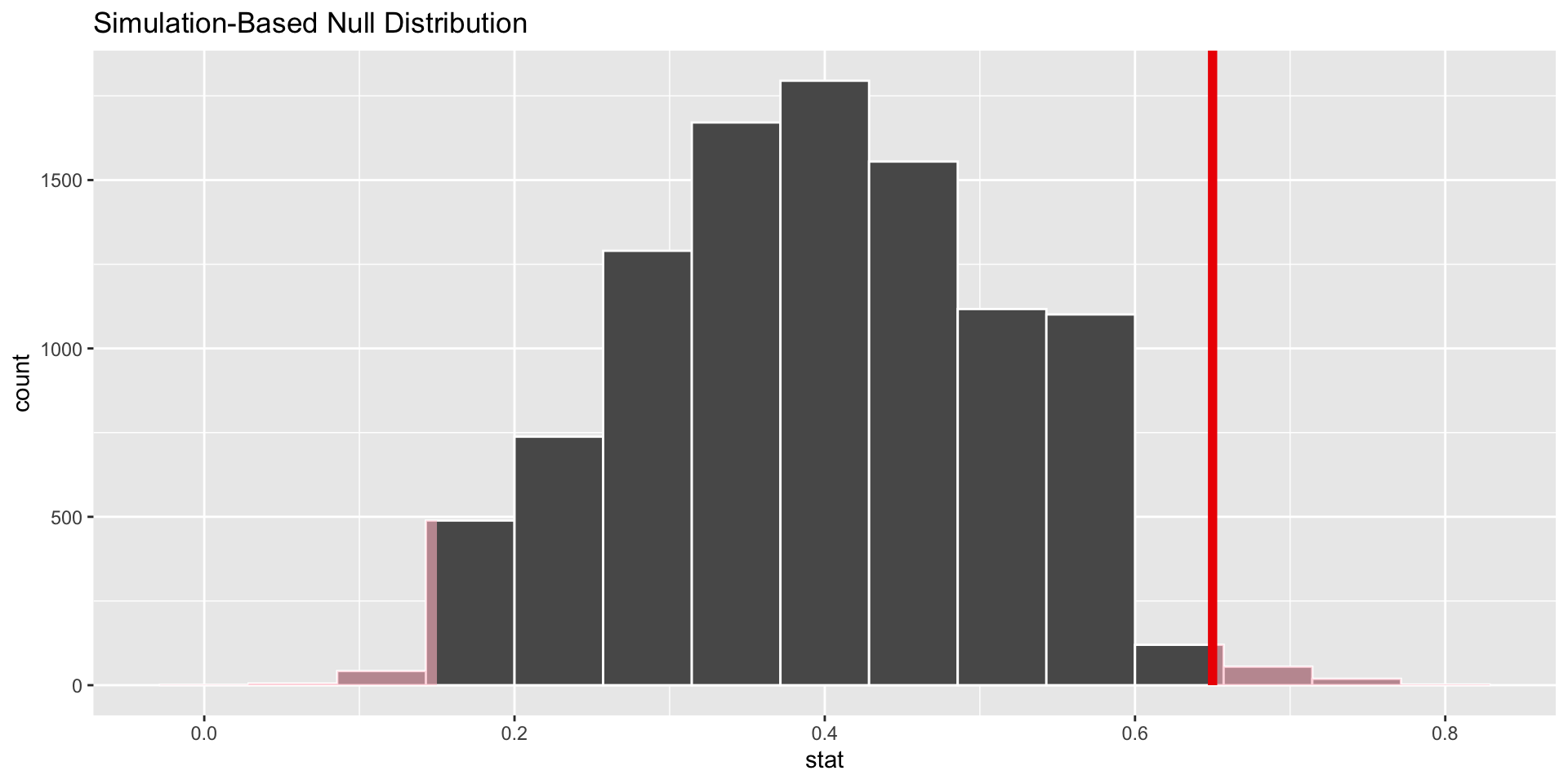
We can use get_pvalue()
# get the pvalue to use.
get_pvalue(x = null_distn_one_prop,
             obs_stat = p_hat,
             direction = "both")
# A tibble: 1 × 1
p_value
<dbl>
1 0.0392Conclusion
Reject null.
This means that the doctor doing the study should believe that locally people have a blood born disease at a different rate than nationally.
Should we do this problem again with a mathematical model.
We should be hesitant, it does not meet the success-failure criterion and the sample is small.
Last example
Problem 11, Ch 16
Statistics and employment In a large university where 70% of the full-time students are employed at least 5 hours per week, the members of the Statistics Department wonder if a smaller proportion of their students work at least 5 hours per week. They randomly sample 25 majors and find that 15 of the students work 5 or more hours each week.
Make sample
Nothing wrong with copying and editing code from above.
# This makes a 60% success sample.

major_sample <-   c(rep("yes", 15), rep("no", 10))

# This saves the sample as a dataframe
major_sample <- as.data.frame(major_sample)

# This changed the name of the variable to "has_disease"
names(major_sample) <-"work"
Make Hypotheses
\[ H_0: p = 0.7 \\ H_a: p < 0.7 \]
\[
\alpha = 0.05
\]
Make p-hat
p-hat:
# There is no simulation happening here. Notice the pipes.
# We are saving p_hat for later... It might be easier to type
# p_hat <- 15/25
p_hat <- major_sample  |>

  # specify which variable you are interested in, and which level is a success (our level is "yes")
  specify(response = work, success = "yes") |>

  # What is the statsitic we want calculated?
  calculate(stat = "prop")
Create parametric distribution w/ infer()
set.seed(2018)


null_distn_one_prop <- major_sample |>

  specify(response = work, success = "yes") |>

  hypothesize(null = "point", p = 0.70) |>

  generate(reps = 10000) |>

  calculate(stat = "prop")
visualize()
#|echo: true

# I'm leaving off the data argument here.
visualise(null_distn_one_prop)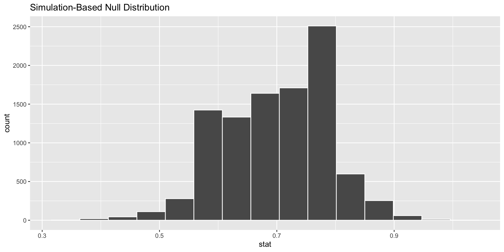
Add the p-value to graph
visualize(null_distn_one_prop) +
  shade_p_value(obs_stat = p_hat, direction = "less")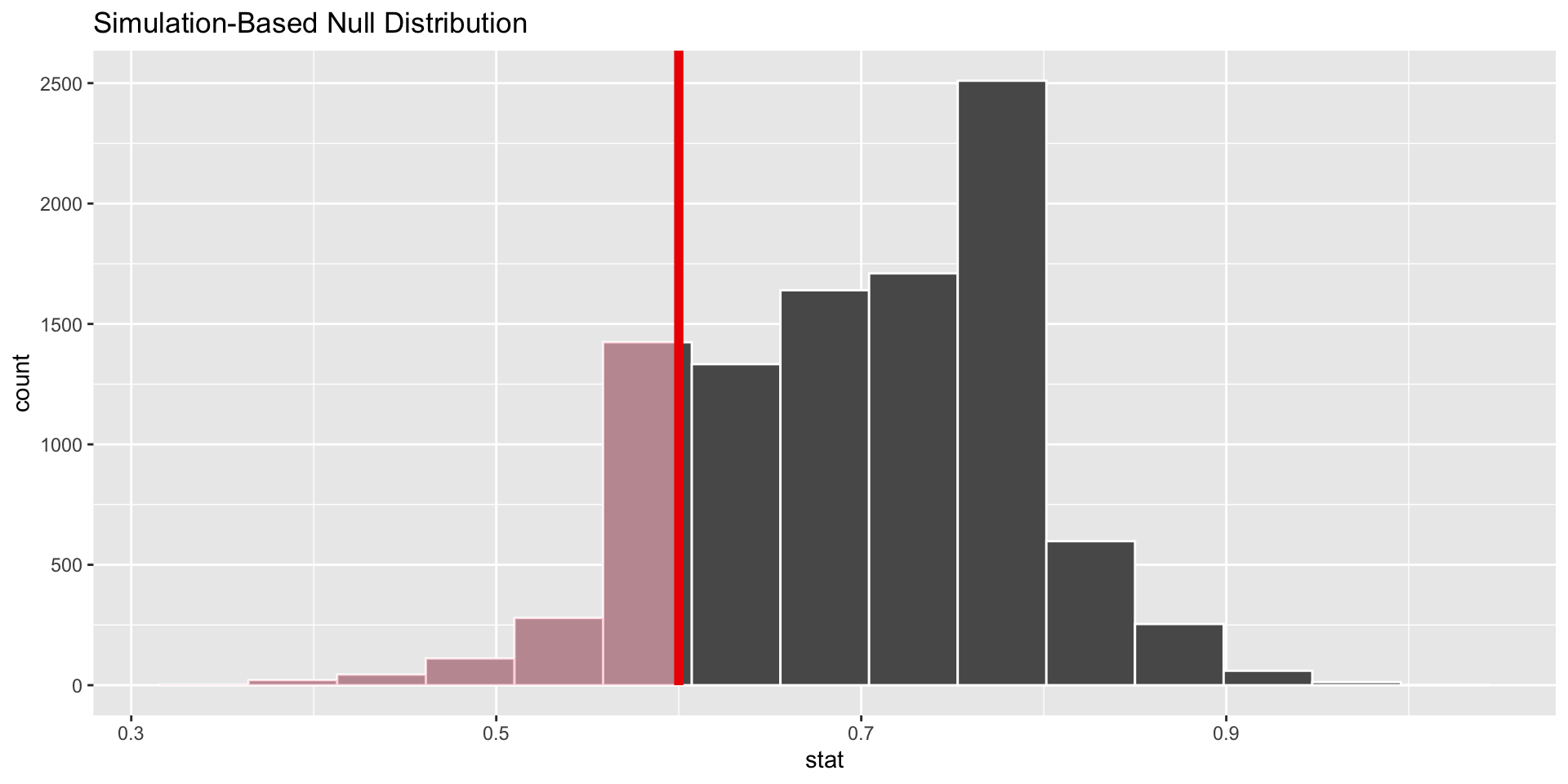
get_pvalue()
pvalue <- null_distn_one_prop %>%
  get_pvalue(obs_stat = p_hat, direction = "less")
pvalue
# A tibble: 1 × 1
p_value
<dbl>
1 0.188Make conclusion
Fail to reject the null hypothesis. It seems that stats majors work the same amount as other students based on our sample.
Could have made a type two error. We failed to reject the null hypothesis when it was incorrect.