# Use the line below to install the babynames package# install.packages("babynames")library(tidyverse)
── Attaching core tidyverse packages ──────────────────────── tidyverse 2.0.0 ──
✔ dplyr     1.1.4     ✔ readr     2.1.5
✔ forcats   1.0.0     ✔ stringr   1.5.1
✔ ggplot2   3.5.1     ✔ tibble    3.2.1
✔ lubridate 1.9.4     ✔ tidyr     1.3.1
✔ purrr     1.0.4
── Conflicts ────────────────────────────────────────── tidyverse_conflicts() ──
✖ dplyr::filter() masks stats::filter()
✖ dplyr::lag()    masks stats::lag()
ℹ Use the conflicted package (<http://conflicted.r-lib.org/>) to force all conflicts to become errors
library(babynames)
1. Wrangle your name out of babynames
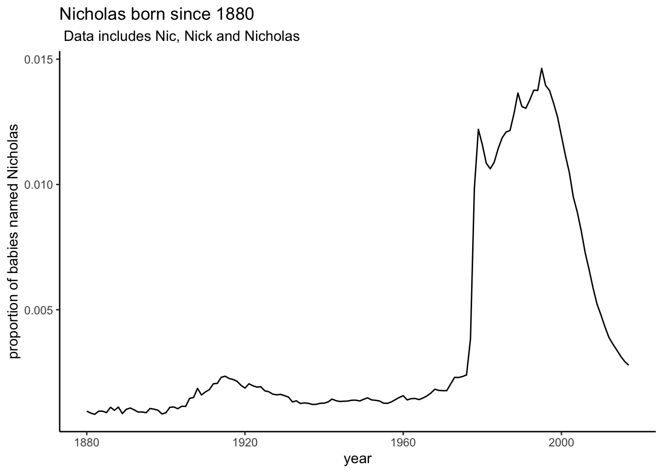
You will want to filter() your name. I would make a vector of names c(“Nic”,“Nicholas”, “Nick”)
In what year was your name the most popular?
Make a graph and facet by sex.
babynames_Nic <- babynames |>filter(name %in%c("Nic","Nicholas","Nick")) |># I've filtered my name outgroup_by(year)|>summarise(prop_total =sum(prop), total =sum(n)) # I've calculated the total of all the Nic's born in a year I'm saving prop because I need it for part 2babynames_Nic
Show the proportion of children with the same names as you over time.
babynames_Nic |>ggplot()+geom_line(aes(x = year, y= prop_total)) +labs(title ="Nicholas born since 1880",subtitle =" Data includes Nic, Nick and Nicholas",y="proportion of babies named Nicholas")+theme_classic()
Part 2. 5 most popular names in the US since 1880
Do some wrangling to tell me the five most popular names separated by sex.
# A tibble: 5 × 2
  name        total
  <chr>       <int>
1 Mary      4123200
2 Elizabeth 1629679
3 Patricia  1571692
4 Jennifer  1466281
5 Linda     1452249
Part 3. Do presidents’ names influence babies’ names?
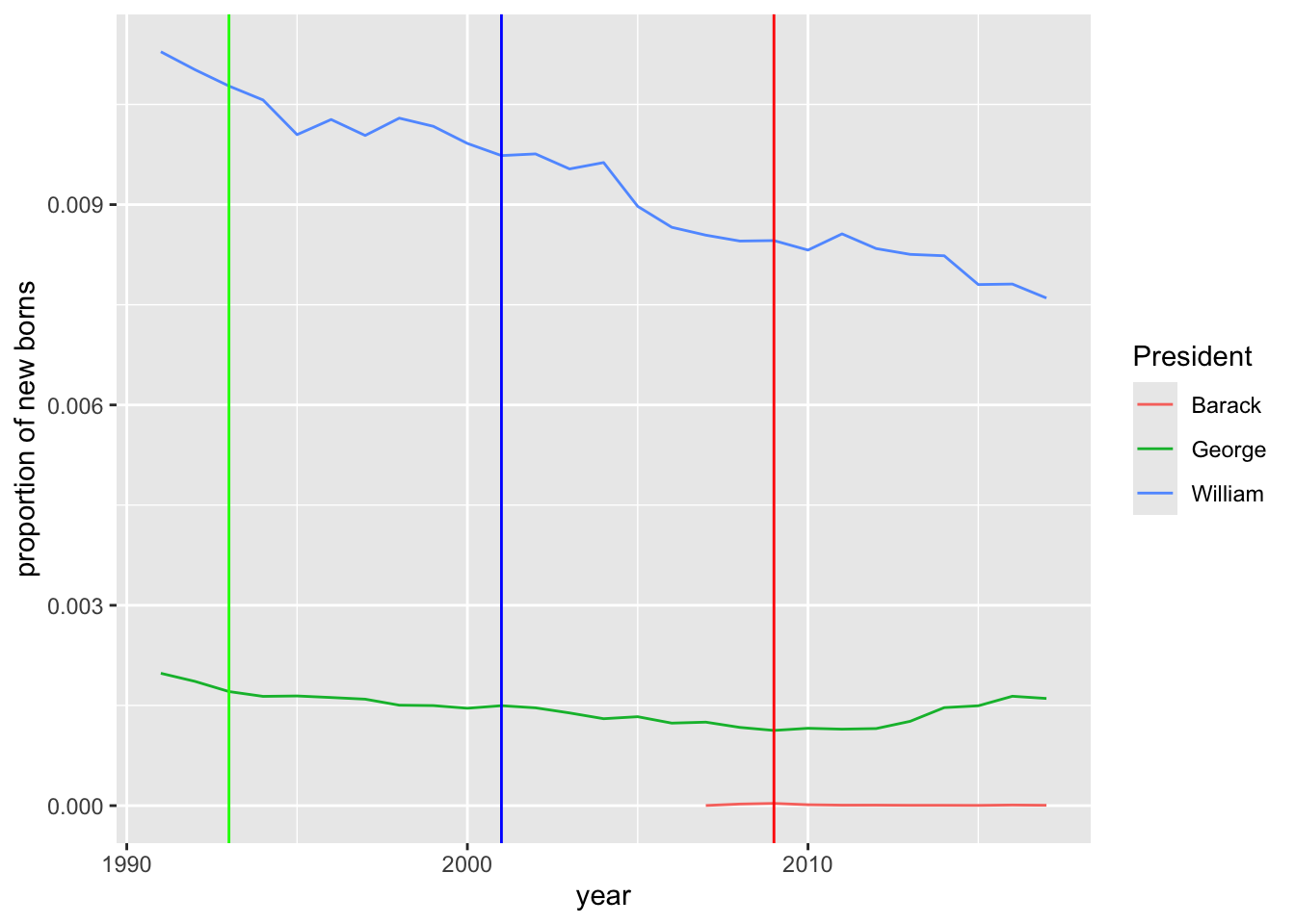
Wrangle the data to show how president’s first names effect newborn babies’ names. Former Presidents
Choose three recent presidents (Donald Trump and Joe Biden might be too recent).
Make one graph that shows all three president’s names. Use geom_vline() to show the year they entered office.
babynames |>filter(name %in%c("William","George","Barack")) |>filter(year >1990) |># I really only care about the years after they were elected. group_by(year, name) |>summarize(prop_total =sum(prop), total =sum(n)) |>ggplot() +geom_line(aes( x= year, y= prop_total, color = name)) +geom_vline(xintercept =2009, color="Red")+geom_vline(xintercept =1993, color="Green")+geom_vline(xintercept =2001, color="Blue")+labs(color ="President",y ="proportion of new borns")
`summarise()` has grouped output by 'year'. You can override using the
`.groups` argument.
Part 4: Most and least.
What is the year in which the most babies were born?