Stop and Frisk Digestion
Nic Schwab
Stop, Question, Frisk
Started in the 1990s
New York City Police Practice
- Police need “reasonable suspicion.”
Leads to mistrust in the police by these groups.
Disclaimer: Personal Bias
I’m not Black.
I am Hispanic.
I look White.
I am not from New York City.
In this data analysis I will have limited perspective.
Disclaimer: Race
This is an acknowledgement that the construct of race exists and plays a part in the way human being interact with each other.
The Data
Here is NYC’s stop and frisk data.
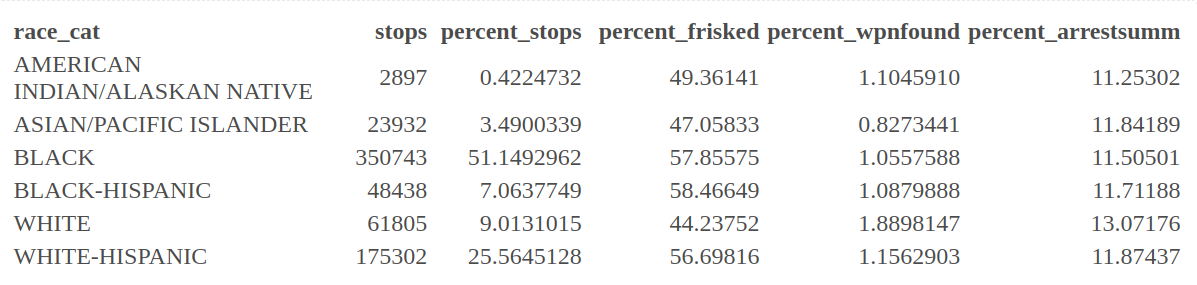
Let’s consider 2011 data
Each column is a variable
and each row is a stop
The variable names are inconsistent across years.
SQF History
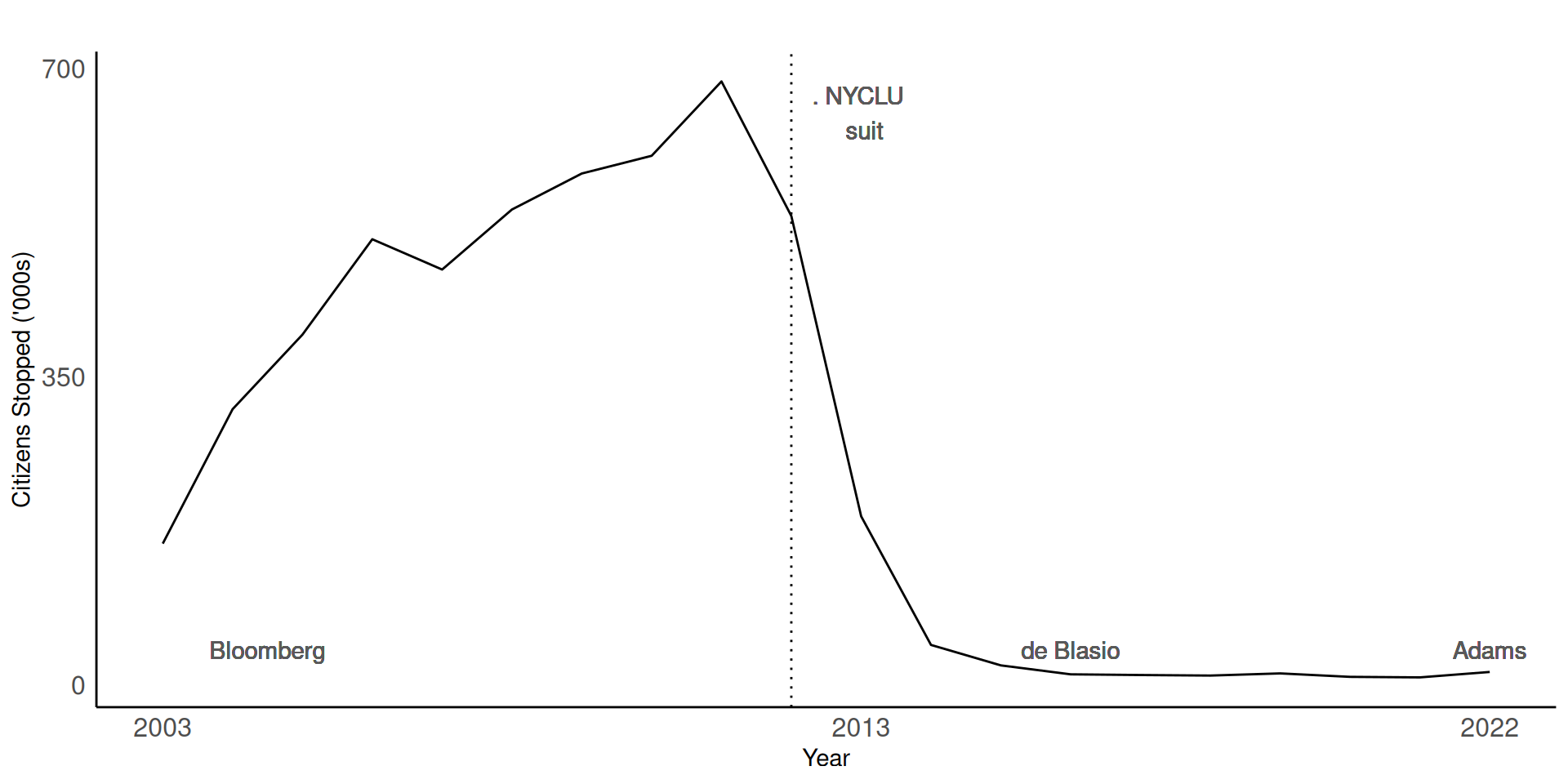
You found:
SQF Lab Solutions 2024
For comparison:
Here’s the demographics of NYC1:
Black: 23.4 %
Latino: 28.9%
White: 39.8%