Color
Ben Baumer
Color
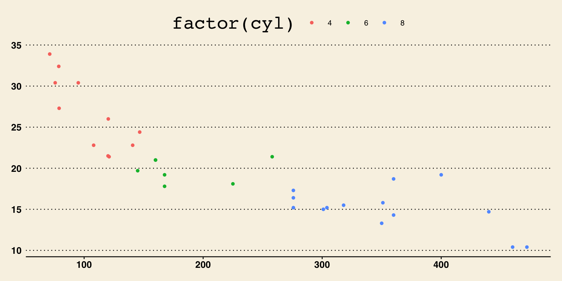
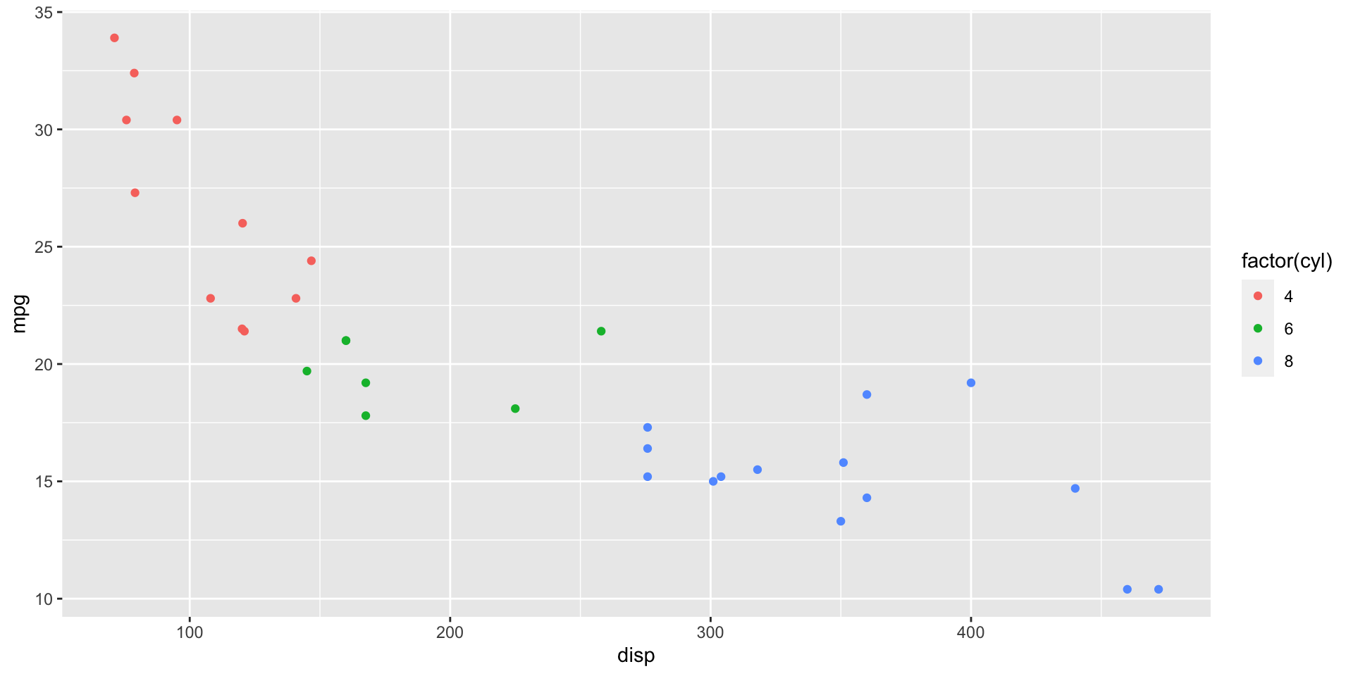
Colors can be added to aestheitcs, or for the whole graph.
Type ?geom_point() to see which asthetics are allowed for the point plot
Three color schemes
Sequential
- Single hue
- Multi-hue
Diverging
Categorical

Big Idea: color choices matter and there are better and worse choices
Sequential, single hue
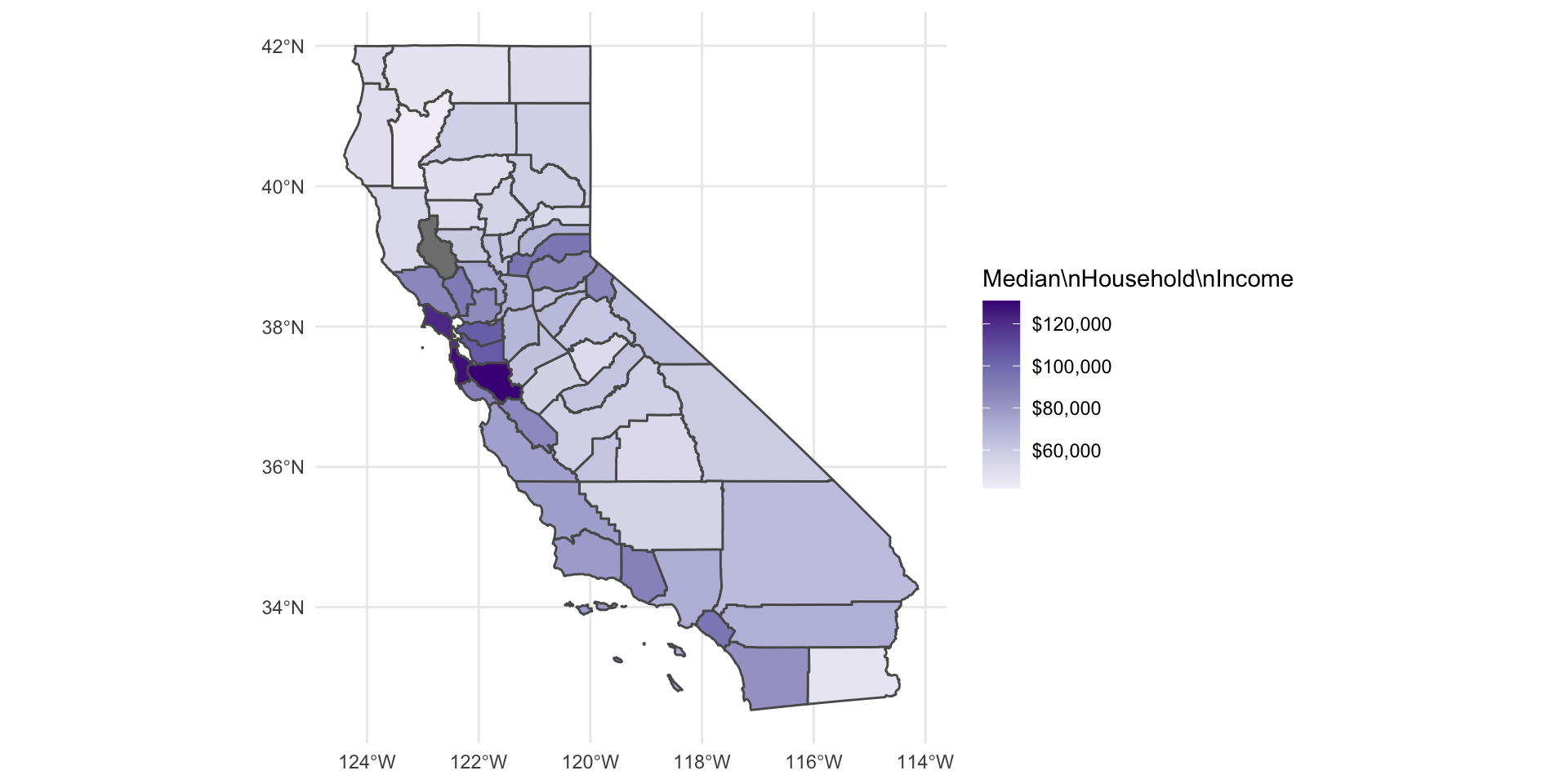
Map saturation to numeric variable
No more than 5–6 levels
People interpret high saturation as more
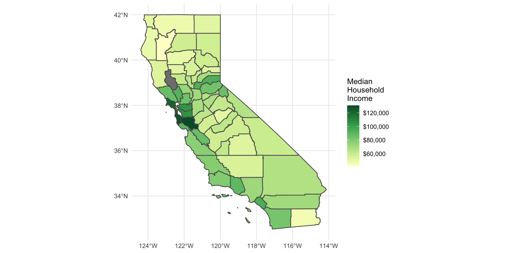
Sequential, double hue
Map hue to numeric variable
Generally, no more than 2 anchor colors
People interpret darker hue as more
Diverging
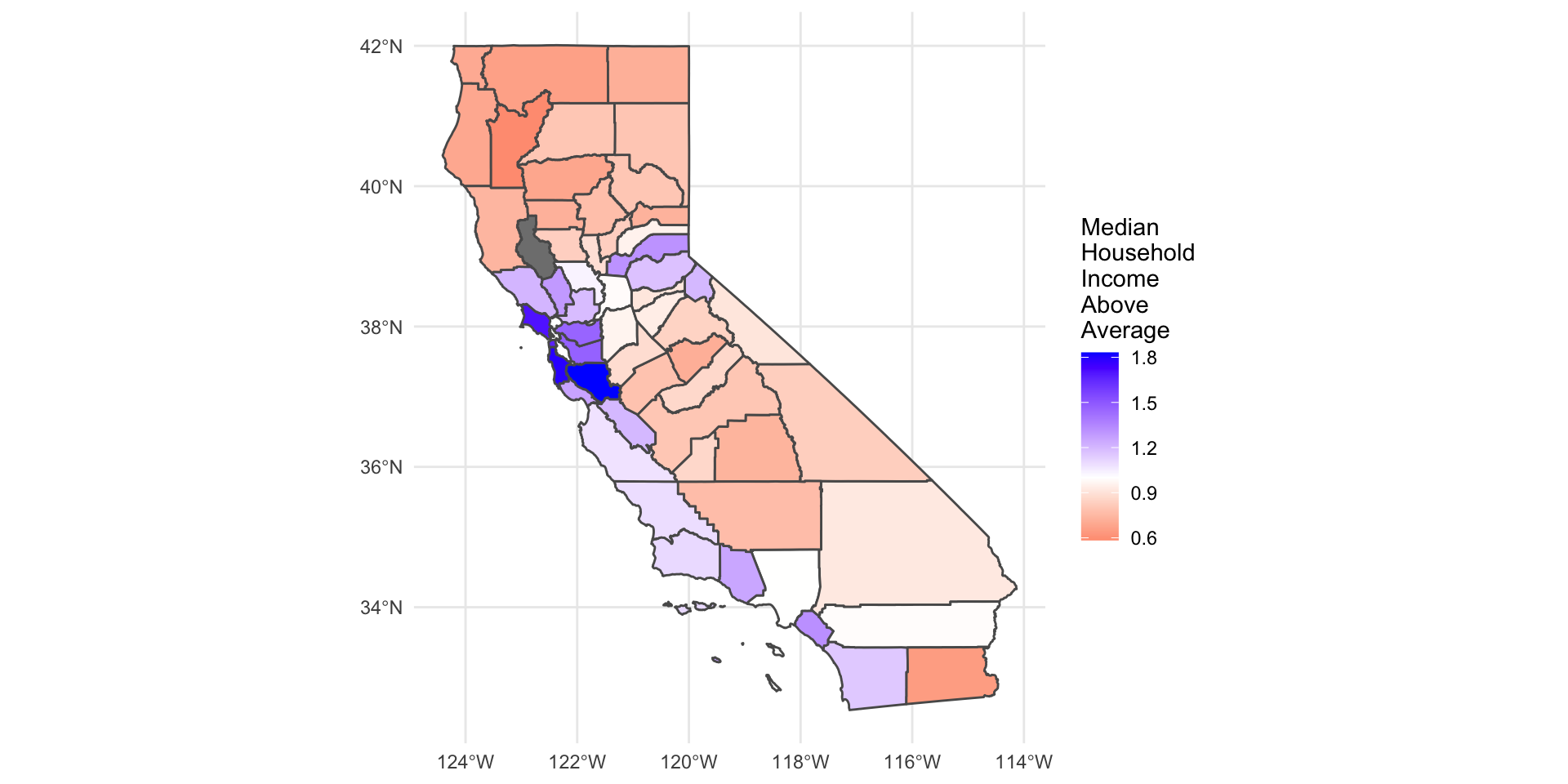
Two colors used to indicate extremes of a range
Neutral color in the middle
distinguish between zero and missing
Categorical
Different color = different category
choose colors that are - perceptually distant - roughly the same saturation
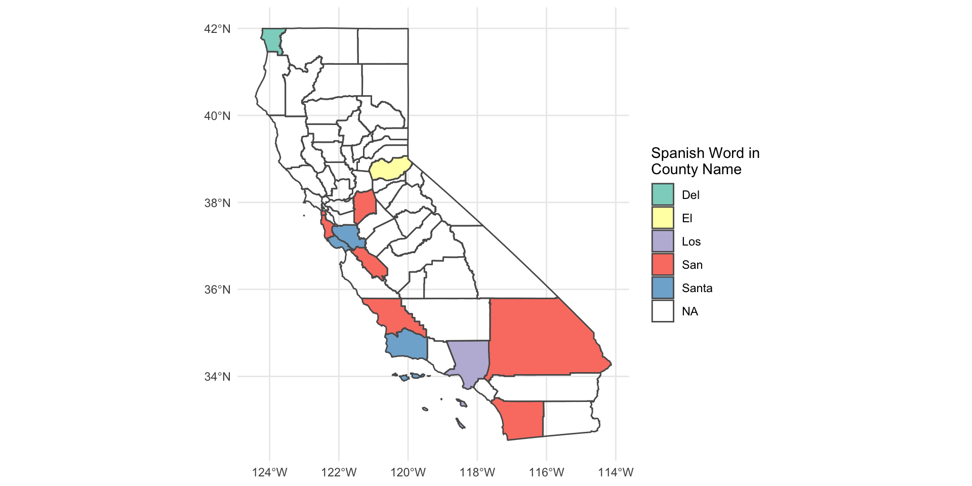
Built-in color palettes
RColorBrewerpackagescale_color_brewer()functionviridispalettes mimicmatplotlibPython library
Sorry, no rainbows

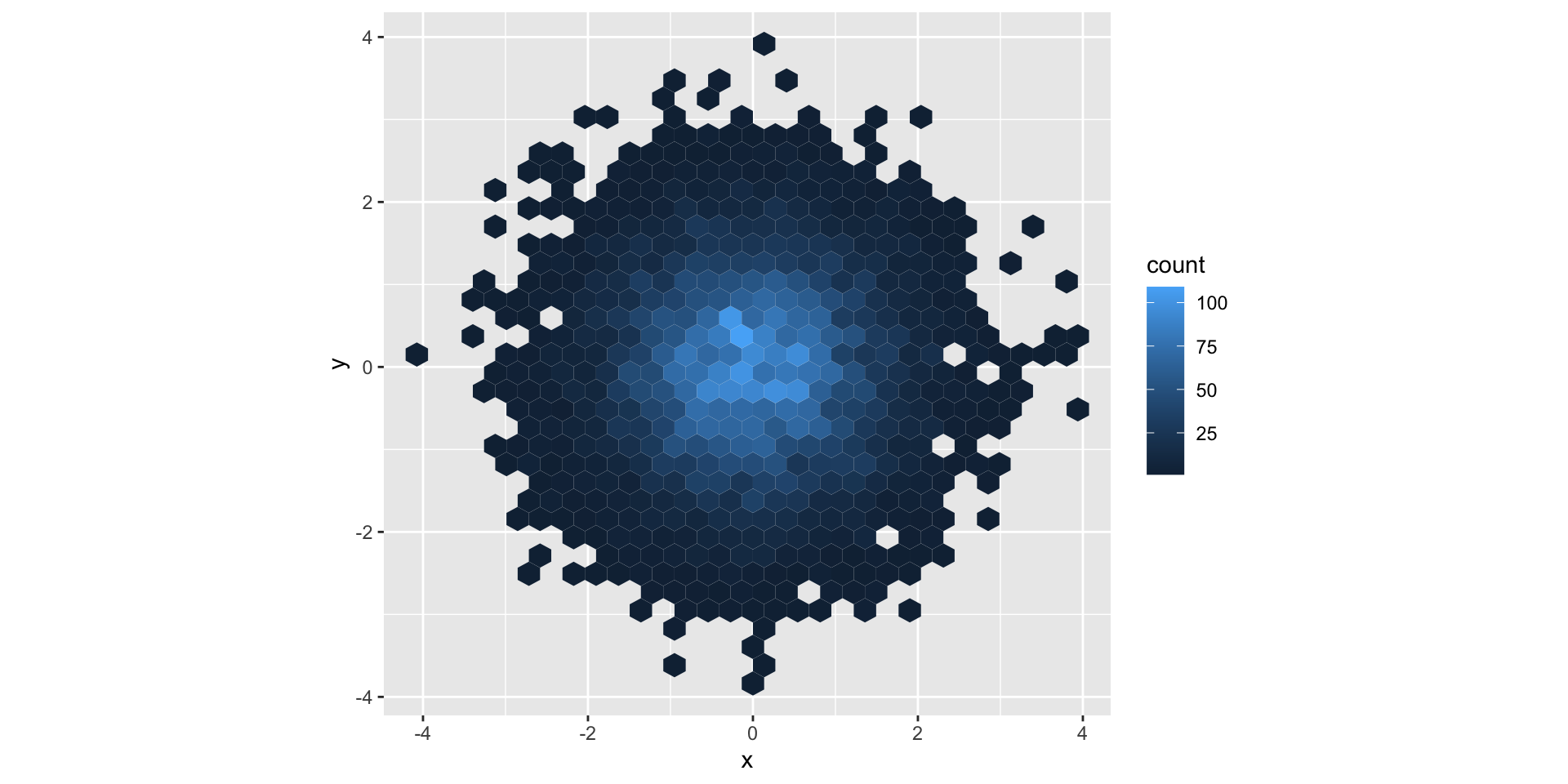
ggplot2 default color
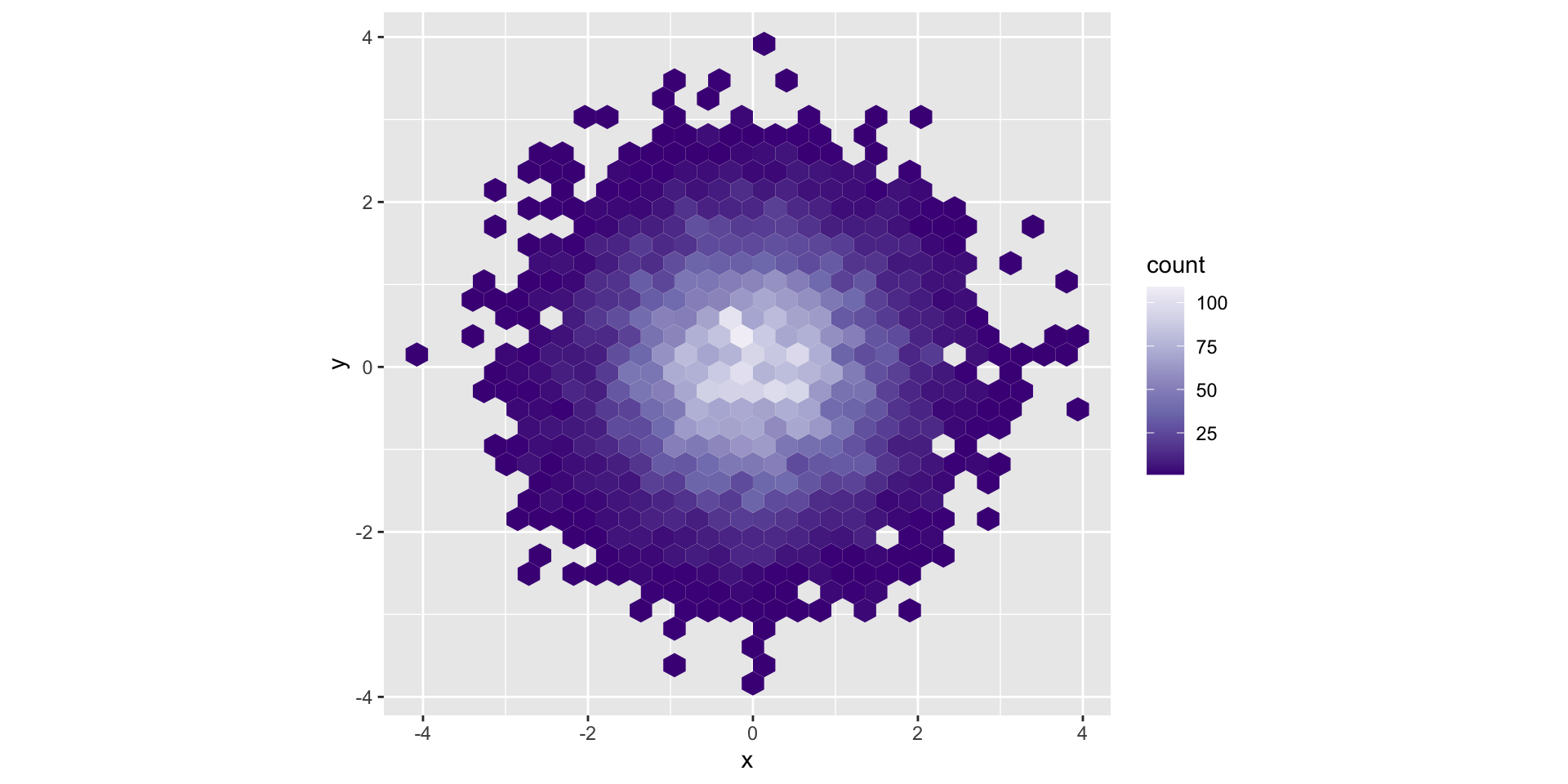
ColorBrewer Purples palette
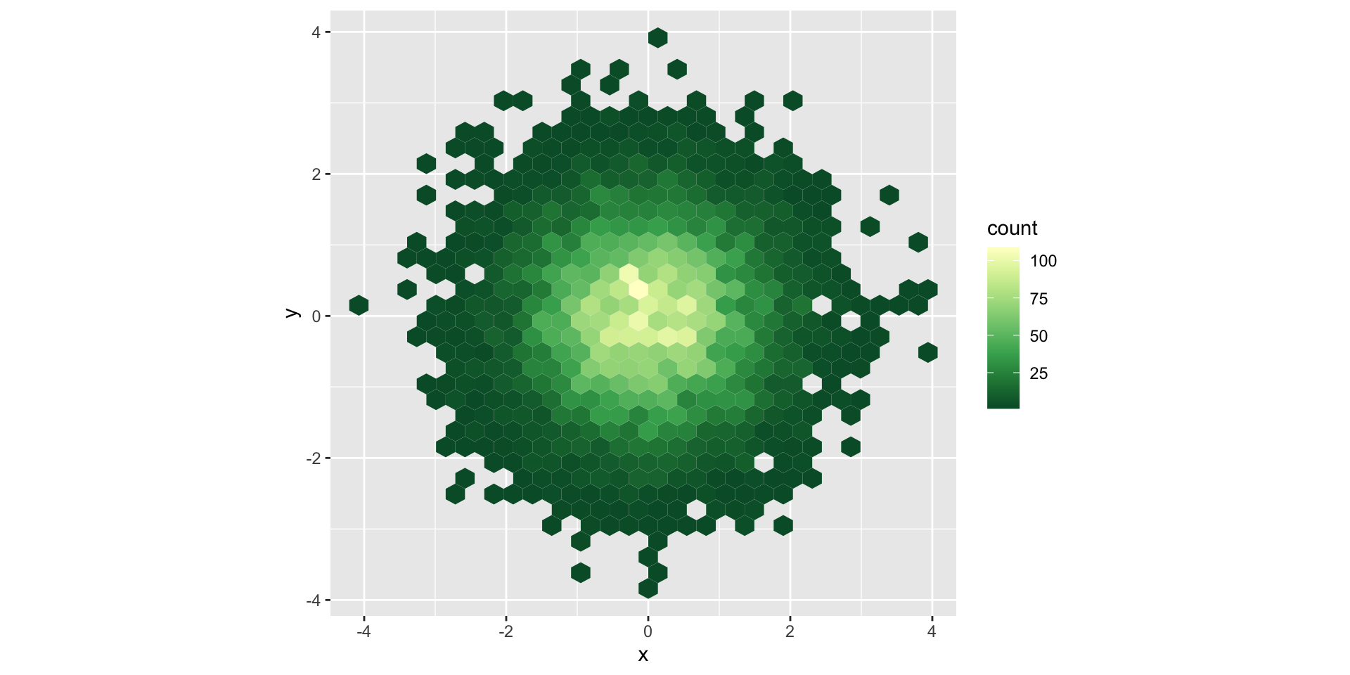
ColorBrewer YlGn palette
Viridis palette

Themes
install.packages(“ggthemes”)
Take any ggplot…
…and change themes with ggthemes
