library(openintro)
library(tidyverse)
library(RColorBrewer)
library(ggthemes)Color exercise
Let’s play around with some colors.
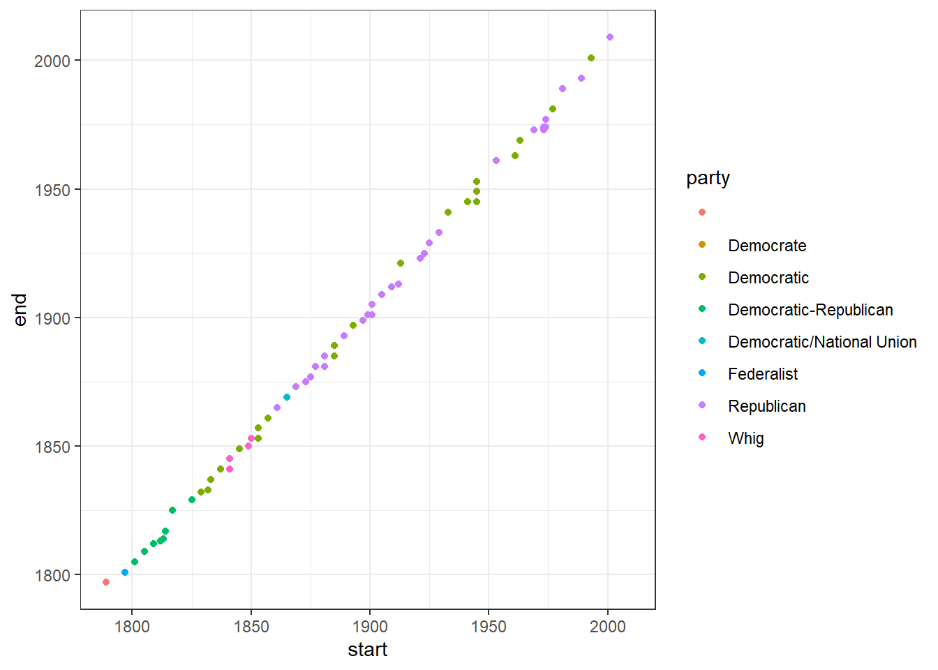
Here’s the presidents data set. Let’s play with themes. Add theme_bw(), theme_economist(), theme_dark(), theme_classic()
president |>
  ggplot(aes(x=start, y =end, color = party) )+
  geom_point()+
  theme_bw()
Warning: Removed 1 rows containing missing values (geom_point).
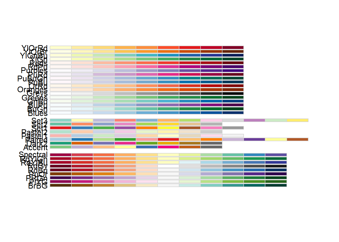
display.brewer.all()
That’s alittle hard to see in the .rmd. Here are the color brewer choices
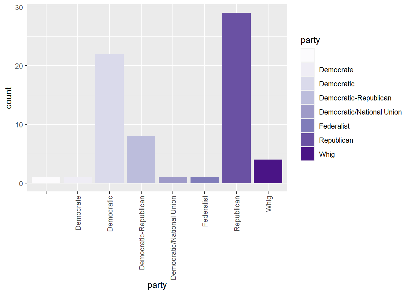
Add scale_fill_brewer
president |>
  ggplot(aes( x = party,fill=party) )+
  geom_bar()+
  scale_fill_brewer(palette = "Purples") +
  theme(axis.text.x = element_text(angle = 90, vjust = 0.5, hjust=1))
Does color add anything to the graph above?
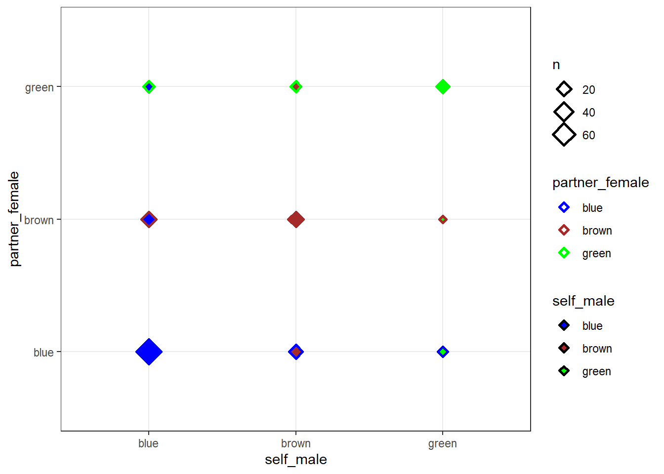
Let’s make a count plot of assortative mating. Notice we are adding a shape aesthetic.
assortative_mating |>
  ggplot(aes(x = self_male, y= partner_female, fill=self_male),)+
  geom_count(aes(color = partner_female), shape=23,stroke=1.5)  +
  scale_fill_manual(values = c("blue","brown","green")) +
  scale_color_manual(values =  c("blue","brown","green")) +
  theme_bw()
How do you feel about color in the above graph?
Try this:
Make sure the above libraries are loaded.
Take the cpr data set from the OpenIntro package
Make a geom_bar() graph for the variable
groupUse the fill aesthetic to color the bars by outcome.
Add a scale_fill_brewer(palette=“” ) to play with different brewer choices.
cpr # A tibble: 90 × 2
group outcome
<fct> <fct>
1 control survived
2 control survived
3 control survived
4 control survived
5 control survived
6 control survived
7 control survived
8 control survived
9 control survived
10 control survived
# … with 80 more rowsCopy most of the chunk you made above.
Add scale_fill_manual(values=c(“black”,“white”)) to manually set two colors for outcomes. Change black and white to other colors. Here’s a list of color choices in R.
Copy most of the chunk again and try scale_fill_fivethirtyeight()