When building graphs with the tidyverse we want the data to be a dataframe. You can use the class() function to determine if a data file is a dataframe.
library(tidyverse)#install.packages(mdsr)library(mdsr)# In OO class() returns the object type. class(iris)
[1] "data.frame"
In this class if a data set is not a data frame (or a tibble) we’ll turn it into one.
Variables
We want to know the variable type (numeric or categorical) we are working with so we can choose the best graph for it.
You can see this by viewing the data.
head(MLB_teams, 1)
# A tibble: 1 × 11
  yearID teamID lgID      W     L  WPct attendance normAttend  payroll metroPop
   <int> <chr>  <fct> <int> <int> <dbl>      <int>      <dbl>    <int>    <dbl>
1   2008 ARI    NL       82    80 0.506    2509924      0.584 66202712  4489109
# ℹ 1 more variable: name <chr>
In general:
integers (int) and floats (dbl) are numeric
strings (chr) and factors (fct) are categorical
However sometime integers can be categorical, and strings can be numeric. We’ll address these situations as they arrise.
Asthetics
Asthetics are the graph features you want to map to your graph. They are often:
x
y
fill
color
shape
the pipe |>
The pipe |> is a common r operator that improves code readability. It mean up this into the first argument of that function.
We generally pipe our data into ggplot() when graphing.
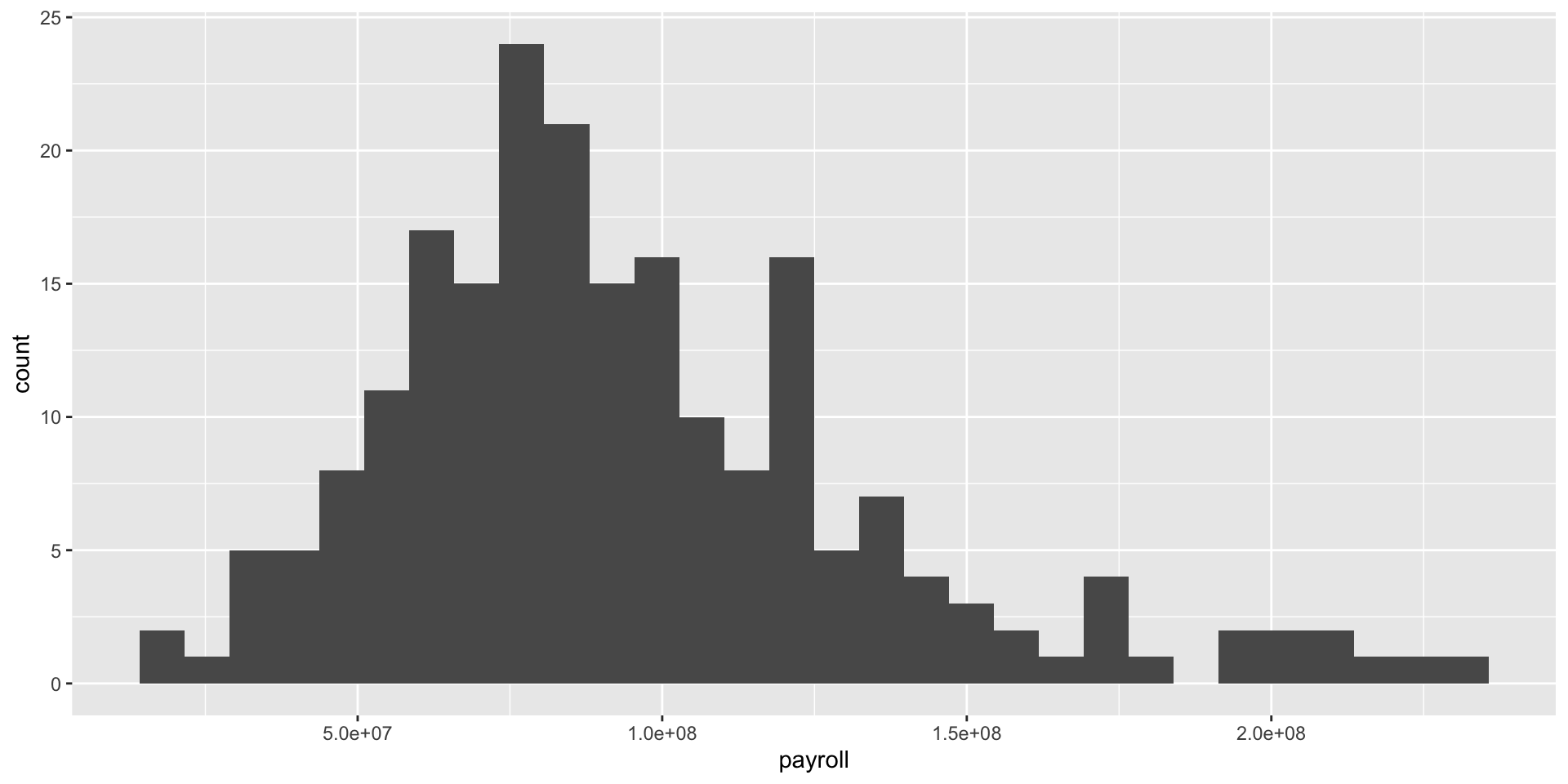
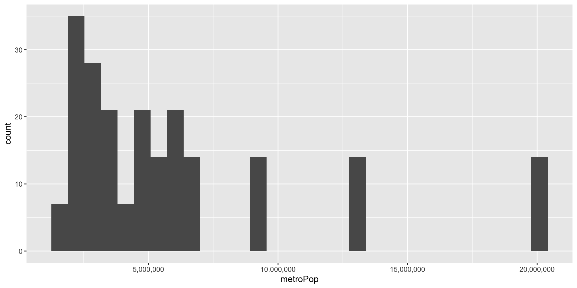
Note that metroPop is a numeric variable, and should be graphed with a histogram.
MLB_teams |># <- this is the dataggplot() +# <- this is what we are doinggeom_histogram( mapping =aes( x = metroPop ) ) # <- This is our asthetic
We can change aes()
Using the code above we can easily change aesthetics.
MLB_teams |># <- this is the dataggplot() +# <- this is what we are doinggeom_histogram( mapping =aes( x = payroll ) ) # <- This is our asthetic{r}
Sidenote: scientific notation
We can drop the scientific notation with scale_x_continuous() function.
Code
MLB_teams |># <- this is the dataggplot() +# <- this is what we are doinggeom_histogram( mapping =aes( x = metroPop ) ) +# <- This is our astheticscale_x_continuous(labels = scales::label_comma())
Faceting
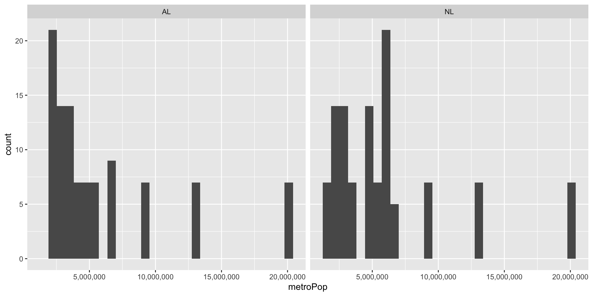
We can also facet our data to make separate plots of features. We have to tell R which variable we want to facet by, I’ll do lgID for league.
Now our x-axis numbers are jumbled. We’ll fix that on the next slide.
Code
MLB_teams |>ggplot() +geom_histogram( mapping =aes( x = metroPop ) ) +facet_wrap(~lgID) +# <-- wrap by leaguescale_x_continuous(labels = scales::label_comma())
Sidenote 2: fixing axes numbers
We can abbreviate the axis numbers in a variety of ways. I had to look this one up, because I don’t use it often.
Code
library(scales) # need this to use cut_short_scale()MLB_teams |>ggplot() +geom_histogram( mapping =aes( x = metroPop ) ) +facet_wrap(~lgID) +scale_x_continuous(labels =label_number(scale_cut =cut_short_scale() ) )
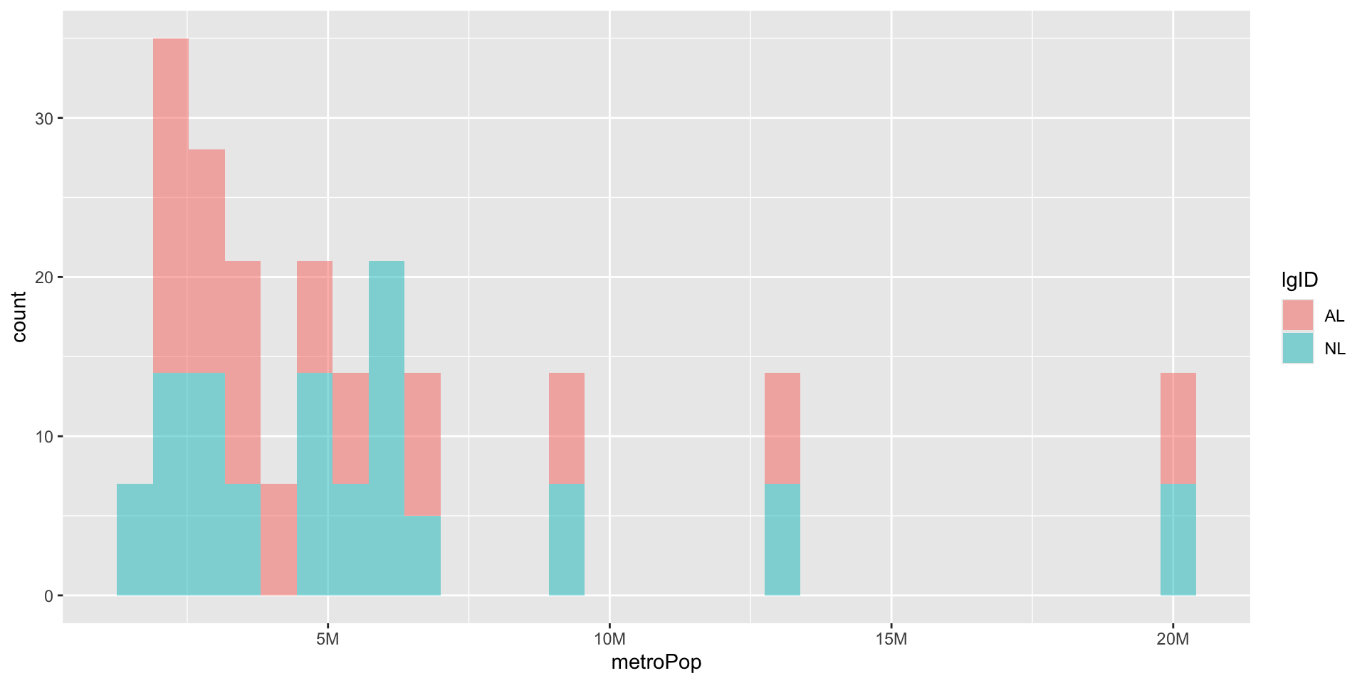
Adjusting alpha
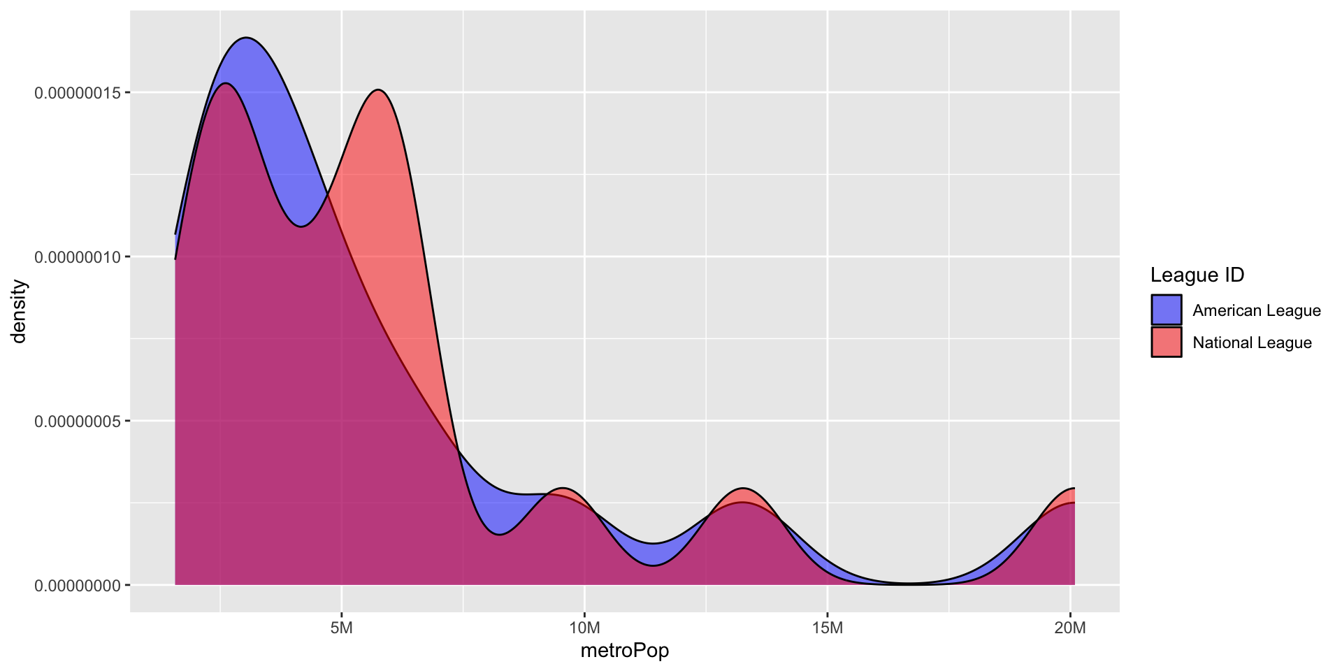
Instead of faceting we can leave the graphs on the same axes but adjust the transparency. alpha is not an aesthetic, but a parameter like mapping. Note: as our lines get longer we break them up.
Code
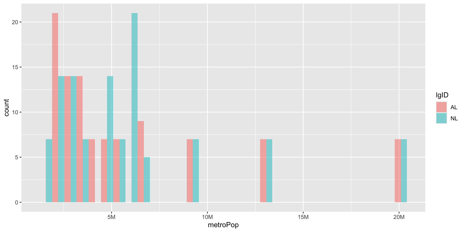
library(scales) # need this to use cut_short_scale()MLB_teams |>ggplot() +geom_histogram( mapping =aes( x = metroPop,fill = lgID, ),alpha =0.5# <- Alpha is outside aes() ) +scale_x_continuous(labels =label_number(scale_cut =cut_short_scale() ) )
Stacked
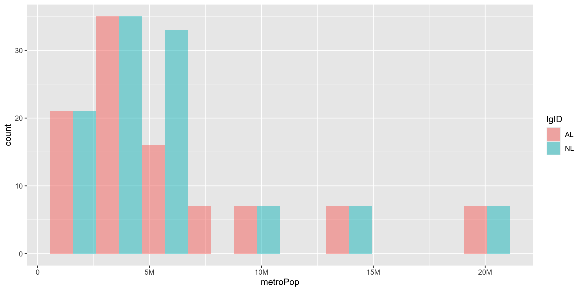
By default R stacks our plots ( and pick gross colors) This make the American League look taller than the National League. We should dodge them instead by setting the position parameter.
Each geom has its own parameters. we can adjust the bin width parameter of geom_histogram() so our bars are not so skinny. We can also specify the exact bins with the bins parameter.
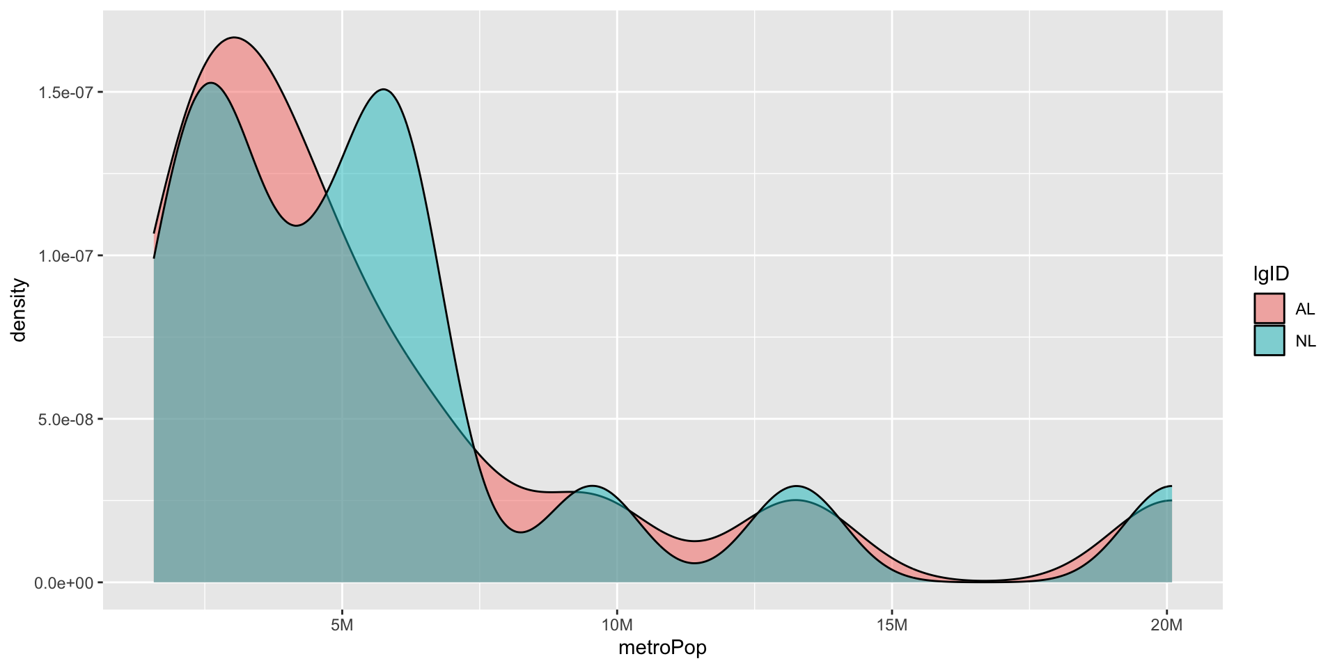
Once you have your graph, you may want to change the geom to try other visual representations of your data. You can easily do this. Let’s change geom_histogram to geom_density(). We get a warning about bins and position, because those are not parameters of geom_density.