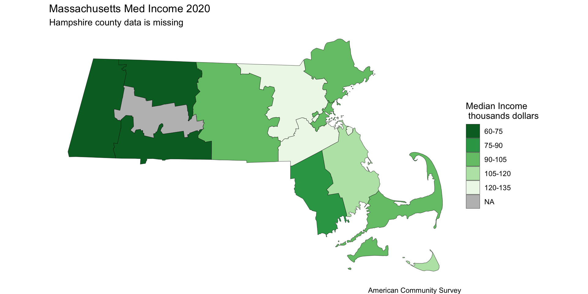
Ethics part 2: Graph Building

CSI-MTH-190

Schwab

Reading

Chapter 8.2

Telling truths with graphs

In general we should not misled with the graphs we make.

We have leaded that darker hue means more and

the direction up is usually considered increasing.

Misleading with Hues

Code
library(tidyverse)
library(tidycensus)

#Make Mass Median Income
mass_med_income <- 
  get_acs(
    geography = "county", 
    variables = c(med_household_income = "B19013_001"),
    state = "MA",
    # We'll need to pivot wider, but that doesn't work with simple features. 
    geometry = TRUE
  )|>
  # Add centroids to each region using purrr package
 tidyr::separate(NAME, c("County", "State"), sep = ", ") |> 
 tidyr::separate(County, c("County", "Fluff"), sep = " ") |>
  mutate(med_household_income = estimate) |>
  mutate(med_income_discrete = cut_interval(
    med_household_income, 
    length = 15000, 
    labels = c("60-75", "75-90","90-105", "105-120","120-135")
    ))
Code
mass_med_income$med_income_discrete[8] = NA

ggplot() +
  geom_sf(data = mass_med_income, aes(fill = med_income_discrete)) +
 # geom_text(data = mass_pop, aes(x = lng, y = lat, label = County)) +
  labs(fill = "Median Income\n thousands dollars",
       title = "Massachusetts Med Income 2020 ",
       #subtitle = "Median income in 2020 was $91,842",
       subtitle = "Hampshire county data is missing",
       caption = "American Community Survey")+
  scale_fill_brewer(palette = "Greens",na.value ="grey", direction = -1 )+
  theme_classic()+
  theme_void()

Misleading with direction

Code
years <- 2009:2023

med_income_state <- map_dfr(years, ~{
  get_acs(
    geography = "state", 
    variables = c(med_household_income = "B19013_001"),
    state = "MA",
    year = .x, # .x refers to the current year in the loop
    geometry = FALSE
  ) |>
    mutate(year = .x) # Add a column so you know which year is which
})
Code
med_income_state |>
    ggplot()+
    geom_point(aes(year,estimate))+
    scale_y_continuous(
        labels = scales::label_comma(),
        transform = "reverse")+
    labs(
        title = "Decrease in MA median income?",
        y = "dollars",
        caption = "American Community Survey"
    )+
    theme_minimal()    

Misleading with scale

Code
med_income_state |>
    ggplot()+
    geom_point(aes(year,estimate))+
    scale_y_continuous(
        labels = scales::label_comma(),
        limits = c(-100000, 200000))+
    labs(
        title = "No change in MA median income?",,
        y = "dollars",
        caption = "American Community Survey"
    )+
    theme_minimal()    

Extra Information

Code
years <- 2009:2023

# 2. Use map_dfr to loop through years and bind them together
med_income_county <- map_dfr(years, ~{
  get_acs(
    geography = "county", 
    variables = c(med_household_income = "B19013_001"),
    state = "MA",
    year = .x, # .x refers to the current year in the loop
    geometry = FALSE
  ) |>
    mutate(year = .x) # Add a column so you know which year is which
})
Code
med_income_county |>
    separate(col = NAME, into = "NAME", sep = " ",extra = "drop")|>
    ggplot()+
    geom_point(
        aes(year, estimate,fill = NAME),
        shape = 21,
        size = 2,
        stroke = 0.1,
        color = "black")+
    scale_y_continuous(
        labels = scales::label_comma(),
        )+
    labs(
        title = "No change in MA median income?",,
        y = "dollars",
        caption = "American Community Survey"
    )+
    theme_minimal()  +
    scale_fill_brewer(palette = 'Set3',na.value ="grey", direction = -1 )

Try to Jitter

Code
med_income_county |>
    separate(col = NAME, into = "NAME", sep = " ",extra = "drop")|>
    ggplot()+
    geom_point(
        aes(year, estimate,fill = NAME),
        shape = 21,
        size = 2,
        stroke = 0.1,
        color = "black",
        position = "jitter")+
    scale_y_continuous(
        labels = scales::label_comma(),
        )+
    labs(
        title = "No change in MA median income?",,
        y = "dollars",
        caption = "American Community Survey"
    )+
    theme_minimal()  +
    scale_fill_brewer(palette = 'Set3',na.value ="grey", direction = -1 )

Remove Info Instead

Code
med_income_county |>
    separate(col = NAME, into = "NAME", sep = " ",extra = "drop")|>
    filter(NAME %in% c("Hampden","Nantucket"))|>
    ggplot()+
    geom_point(
        aes(year, estimate,fill = NAME),
        shape = 21,
        size = 2,
        stroke = 0.1,
        color = "black")+
    geom_point(data = med_income_state, aes(year,estimate))+
    scale_y_continuous(
        labels = scales::label_comma(),
    )+
    labs(
        title = "Massachusetts Median Income ",
        subtitle = "Nantucket, Hampden and the State Average",
        y = "dollars",
        caption = "Showing the counties with highest and lowest median income as well as the average.\n source: American Community Survey"
    )+
    theme_minimal()  +
    scale_fill_brewer(palette = 'Set3',na.value ="grey", direction = -1 )