Color Theory
CSI-MTH-190
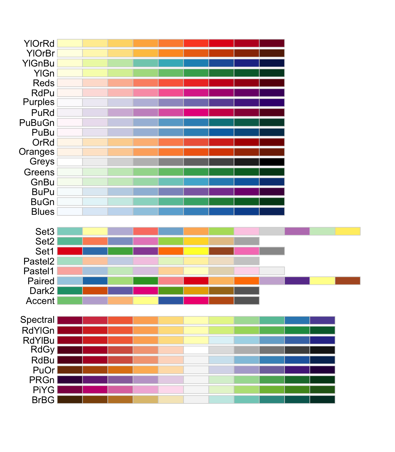
R Color Brewer palletts
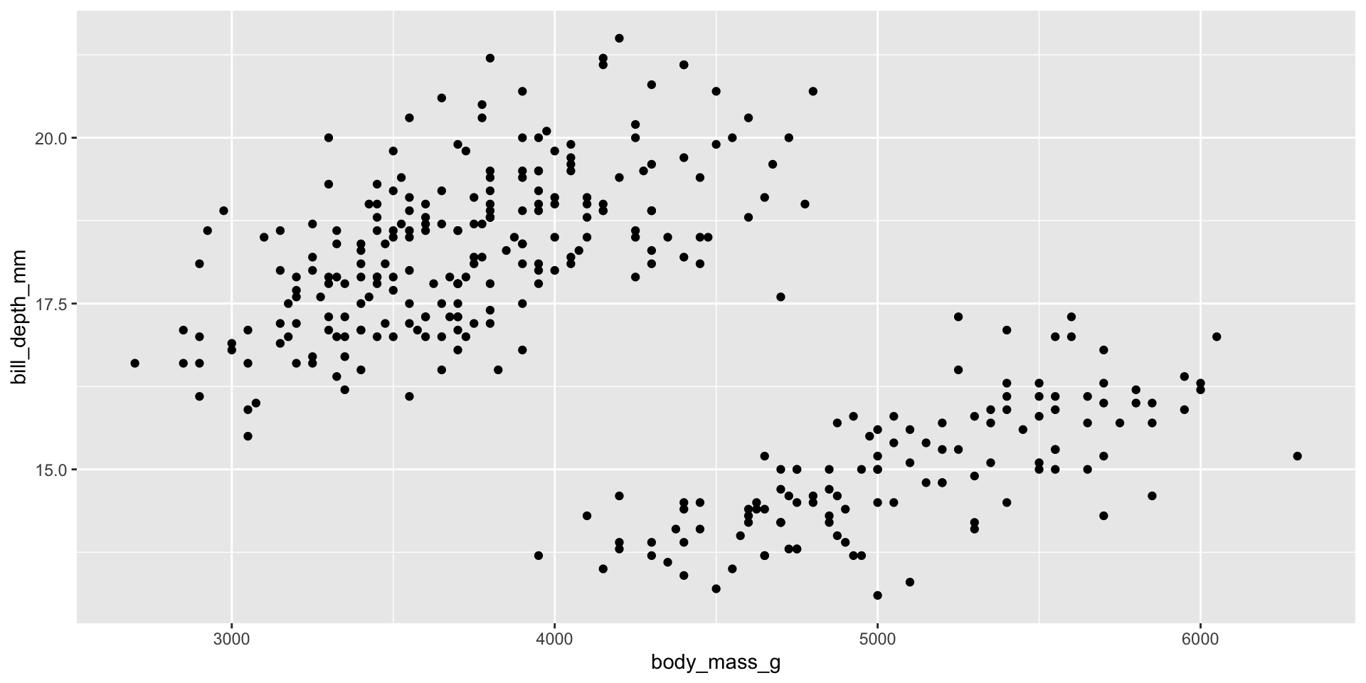
Base Graph
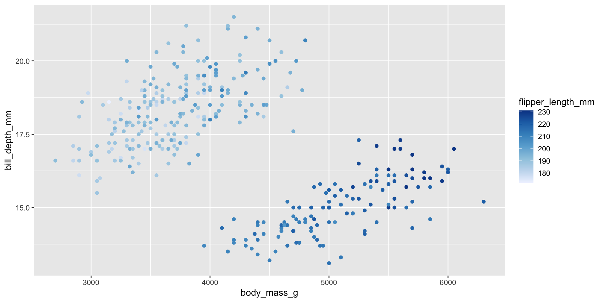
Below is a scatter plot of body_mass_g vs bill_depth_mm.
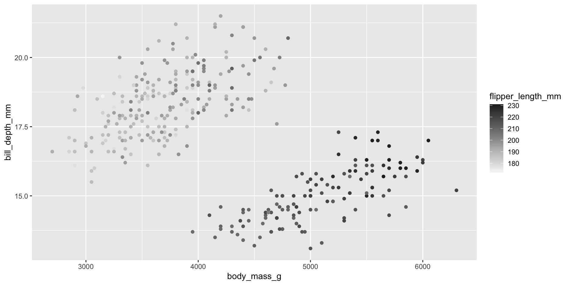
Sequential 1
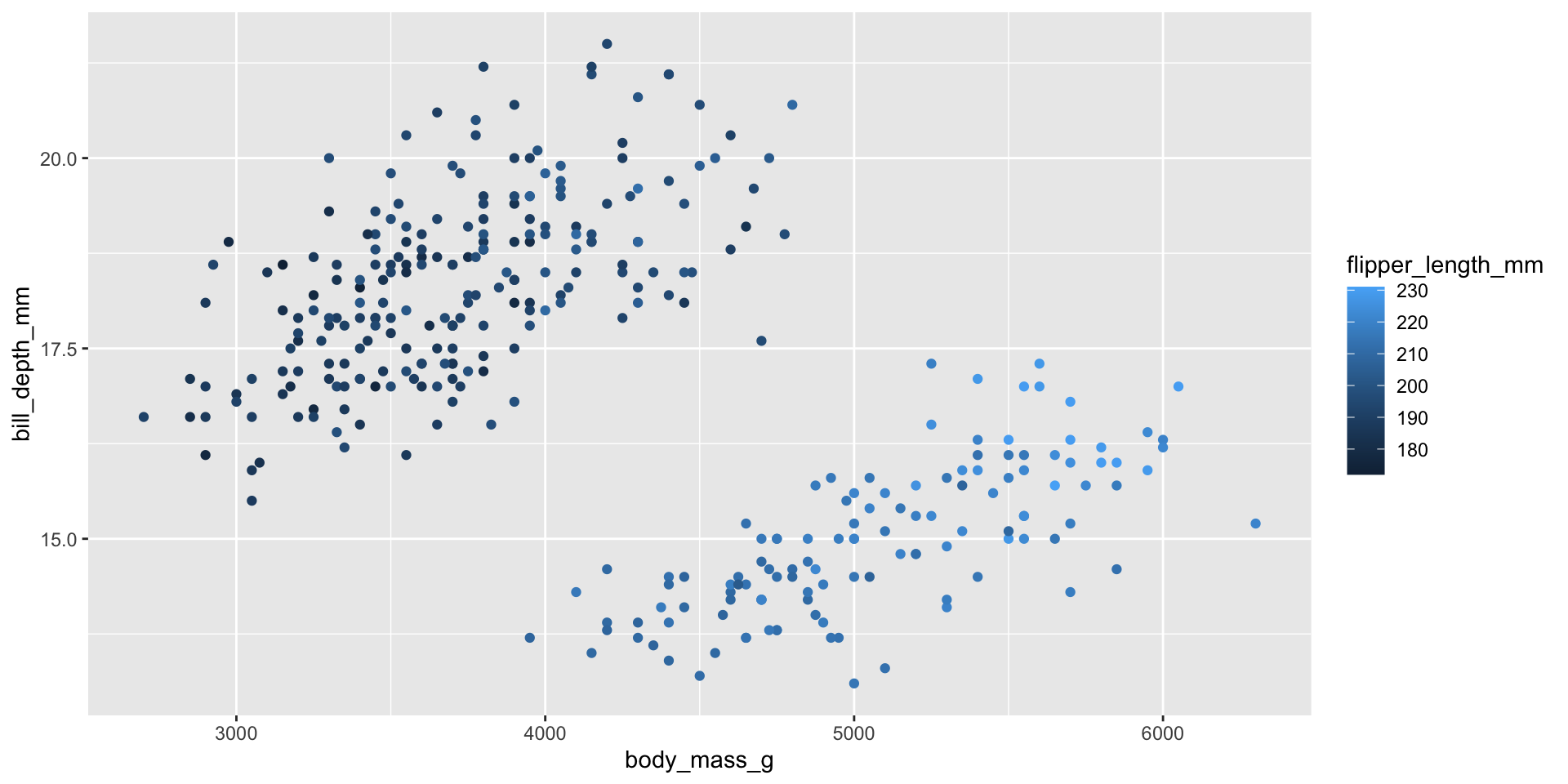
I’d like to show the flipper length as a third variable. flipper_length_mm is a continuous and numeric variable. We can color by it.
Sequential 2
The lighter color should indicate less.
To reverse it I’ll add scale_color_distiller(direction = 1) because we’re working with a continuous variable and we’re coloring.
Sequential 3
Using the default color isn’t great. Let’s choose a premade brewer palette.
To reverse it I’ll add scale_color_distiller(direction = 1) because we’re working with a continuous variable and we’re coloring.
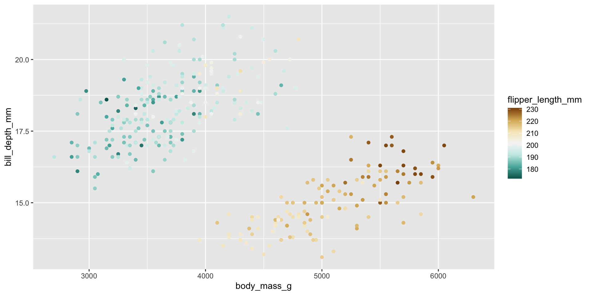
Diverging Palettes
If we want to use two base colors, one to show high values and the other to show low. We can use a diverging palette.
Here the brown is long flipper and dark blue is short flipper.
Diverging Palettes 2
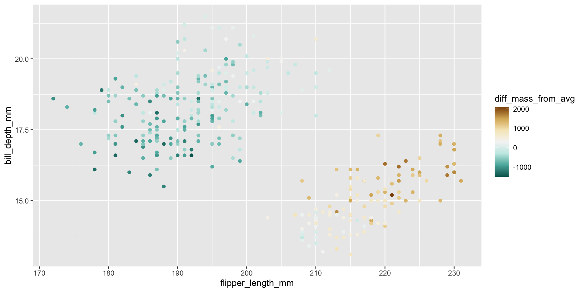
It often makes more sense to use a diverging palette with the middle being zero.
Here I do a bit of wrangling to add a new column, which captures the difference from the average height.
Diverging Palettes 3
I’m adding a circle around each point so they are easier to see.
Code
ave_mass = mean(penguins$body_mass_g,na.rm = TRUE)

penguins |>
  mutate(diff_mass_from_avg =body_mass_g - ave_mass)|>
  ggplot()+
  geom_point(aes(
    x = flipper_length_mm,
    y = bill_depth_mm,
    fill = diff_mass_from_avg,
    ),
    shape = 21,   # <- this is a circle that allows outlining
    color = "black",  # <- outline color
    stroke = 0.3,    # <- outline thickness
    size = 3)+
  scale_fill_distiller(palette = "BrBG")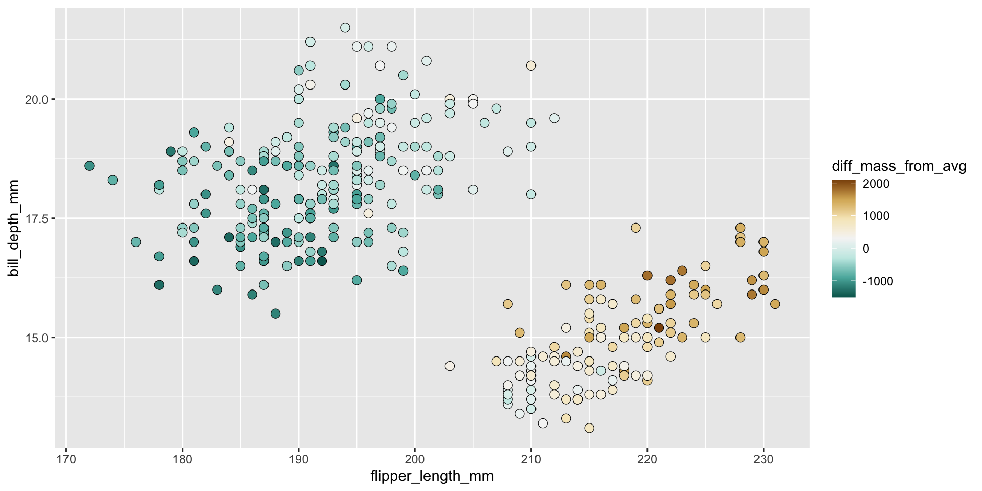
Diverging Palettes 4
Missing Data should be clearly represented with grey or a like color.
Code
library(tidycensus)

#Make Mass Median Income
mass_med_income <-
  get_acs(
    geography = "county",
    variables = c(med_household_income = "B19013_001"),
    state = "MA",
    # We'll need to pivot wider, but that doesn't work with simple features.
    geometry = TRUE
  )|>
  # Add centroids to each region using purrr package
 tidyr::separate(NAME, c("County", "State"), sep = ", ") |>
 tidyr::separate(County, c("County", "Fluff"), sep = " ") |>
  mutate(med_household_income = estimate) |>
  mutate(med_income_discrete = cut_interval(
    med_household_income,
    length = 15000,
    labels = c("60-75", "75-90","90-105", "105-120","120-135")
    ))
Code
mass_med_income$med_income_discrete[8] = NA

ggplot() +
  geom_sf(data = mass_med_income, aes(fill = med_income_discrete)) +
 # geom_text(data = mass_pop, aes(x = lng, y = lat, label = County)) +
  labs(fill = "Median Income\n thousands dollars",
       title = "Massachusetts Med Income 2020 ",
       #subtitle = "Median income in 2020 was $91,842",
       subtitle = "Hampshire county data is missing",
       caption = "deptofnumbers.com")+
  scale_fill_brewer(palette = "PuOr",na.value ="grey" )+
  theme_classic()+
  theme_void()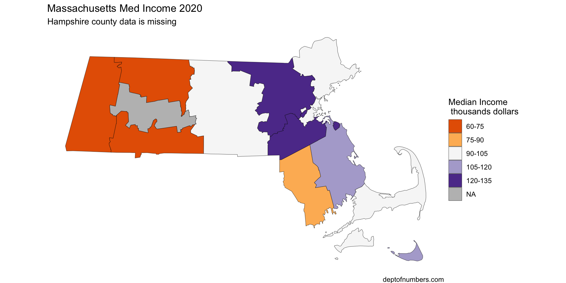
Qualitative Data
If the variable is categorical use a qualitative palette.
Limit yourself to six categories.
Code
fun_facts <- tribble(
  ~fun_facts,
  "County of Mass Bay Colony",
  "County of Plymouth Colony",
  "Newest",
  "Island",
  "County of Mass Bay Colony",
  "County of Plymouth Colony",
  "Newest",
  "I live here",
  "County of Mass Bay Colony",
  "Newest",
  "County of Plymouth Colony",
  "Boarders Three States",
  "Boarders Three States",
  "Island"
)

ggplot() +
  geom_sf(data = bind_cols(mass_med_income, fun_facts), aes(fill = fun_facts)) +
  labs(fill = "",
       title = "Massachusetts Med Income 2020 ",
       subtitle = "Fun Facts about MA Counties",
       caption = "source: https://en.wikipedia.org/wiki/\nList_of_counties_in_Massachusetts")+
  scale_fill_brewer(palette = "Set2",na.value ="grey" )+
  theme_classic()+
  theme_void()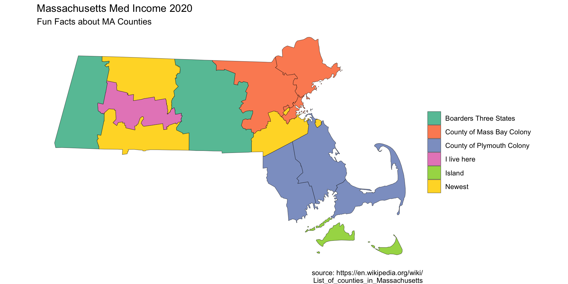
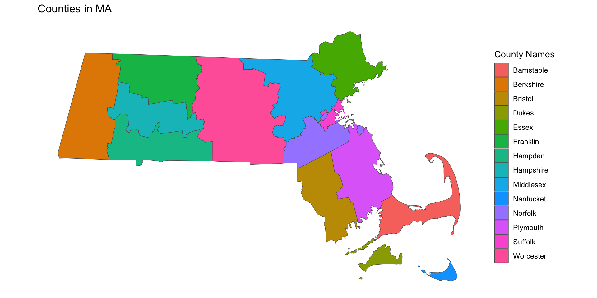
Too many categories and Rainbows!
This is the default option in R
Code
ggplot() +
  geom_sf(data = bind_cols(mass_med_income, fun_facts), aes(fill = County )) +
 # geom_text(data = mass_pop, aes(x = lng, y = lat, label = County)) +
  labs(fill = "County Names",
       title = "Counties in MA")+
  theme_classic()+
  theme(axis.title.x=element_blank(),
        axis.text.x=element_blank(),
        axis.ticks.x=element_blank(),
        axis.title.y=element_blank(),
        axis.text.y=element_blank(),
        axis.ticks.y=element_blank(),
        axis.line = element_blank()
        )
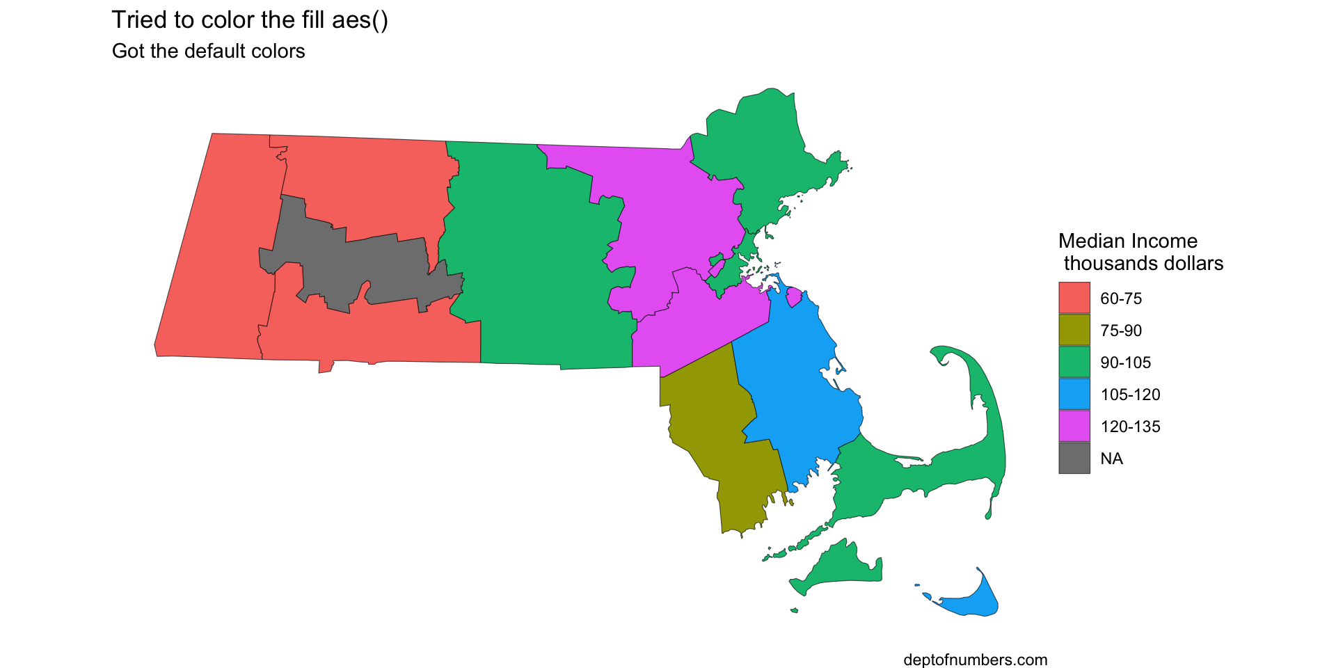
Confusing fill and color
Don’t confuse fill and color. If aes(fill) then you must use scale_fill_brewer() not scale_color_brewer(), and vice versa.
ggplot() +
  geom_sf(data = mass_med_income, aes(fill = med_income_discrete)) +
  labs(fill = "Median Income\n thousands dollars",
       title = "Tried to color the fill aes()",
       subtitle = "Got the default colors",
       caption = "deptofnumbers.com")+
  scale_color_brewer(palette = "PuOr",na.value ="grey" )+
  theme_classic()+
  theme_void()